Project Introduction
For this project, I was responsible for designing a messaging app. I came up with the concept to create a messaging app for a creative agency. Employees of the agency could have all their work correspondence in one place, and they could message any contact in the company, even if they had never exchanged contact info.
I was able to put together this app design from concept to the first iteration of high fidelity wireframes in an evening.
Low Fidelity Wireframe Sketches
High Fidelity Wireframes: First Iteration
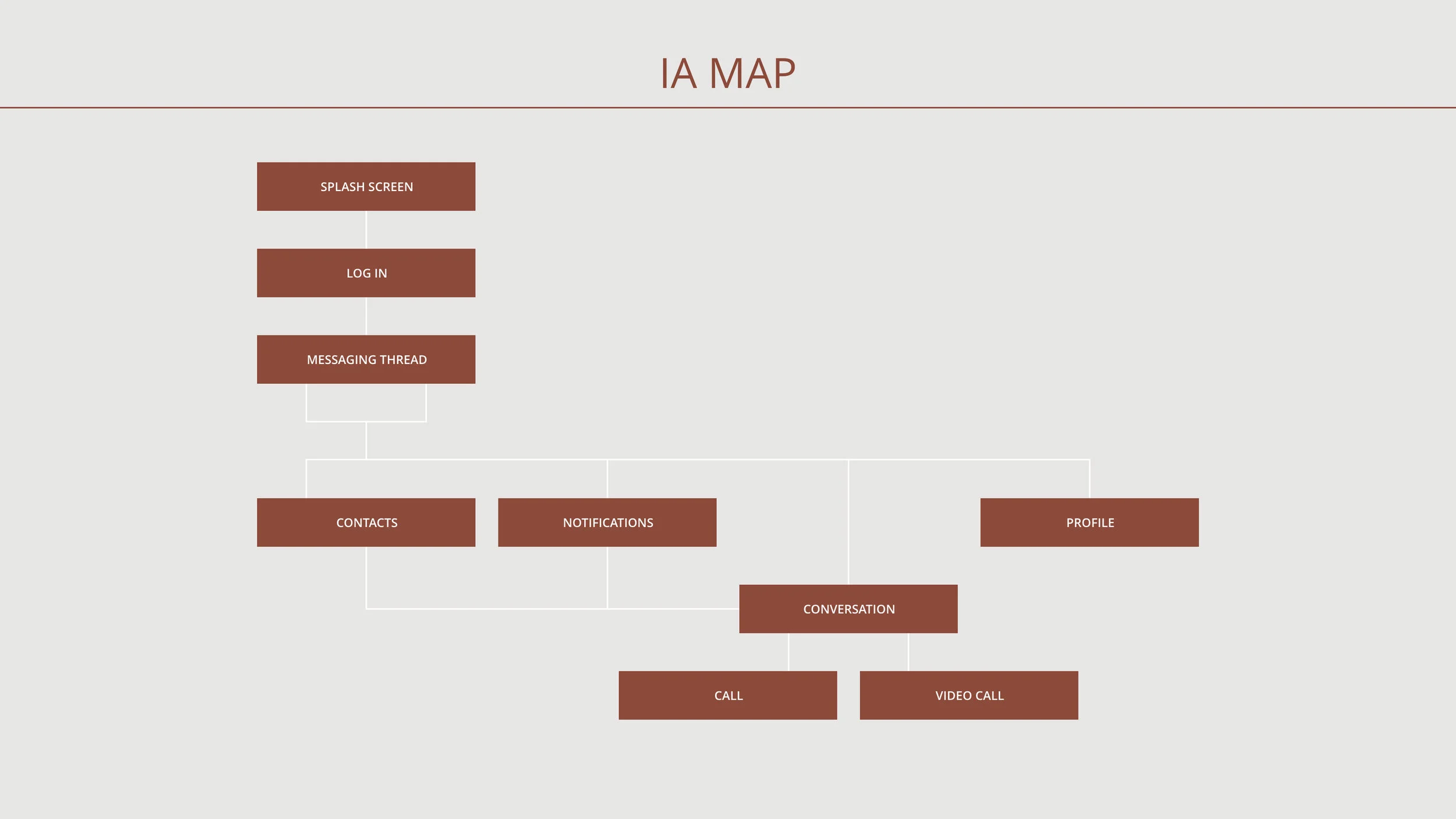
For this project, I was asked to create three High Fidelity Wireframes for a Messaging app: conversation thread screen, conversation screen, and a contacts screen.
I created a red icon to denote which emails were unopened, and when there were unopened Notifications.
For the user, I included a preview of the message, as well as their contact’s title within the company, incase it was someone in the company the user had not met.
The top Navigation Bar let’s the user know who they are messaging, and gives them the option to call or video call. I included a call feature as planning project details can sometimes be faster and easier over a quick call. I included the video call feature as this is a creative agency, and sometimes making plans means visually collaborating with a coworker, even if they on their way to a photoshoot for a client.
The day after designing these wireframes, animation was added for instances such as revealing the keyboard.
The Contacts screen contains information the user needs, such as their contact’s photo and title with the company.
The bottom Navigation Bar let’s the user know what screen they are on.
High Fidelity Wireframes: Second Iteration
I wanted to try out a secondary color palette before designing for iOs, so I made a second iteration to conduct a User Preference Test.
User Preference Test
To decide which color palette to go with for the final design, I conducted a User Preference Test.
I showed users these two screens individually, so they could see the color palettes without distraction, and informed them there would be a poll to decide which they preferred.
Cachae: “The coral one! I like the sage one too, but the gray against the white feels a bit too contrasty.”
Results: In the poll that I used to conduct the User Preference Test, there was a heavy preference for the original coral color palette.
Final High Fidelity Wireframes
Confident with this color palette now, I went on to design for iOS.
Retrospective
What Went Well:
I wanted to practice designing for Android more, so I’m glad I decided to begin this project with designing for Android instead of beginning with iOS like I usually do.
It was also nice to see my flow become faster, as I conceptualized and designed High Fidelity Wireframes within an evening.
I enjoyed developing the branding for this concept, and I’m happy with how it came out. It was helpful to do a User Preference Test, as I was happy with the first color palette at the beginning, but when I questioned it, had overwhelming user preference in support of it.
I also really liked doing the User Preference Test: seeing the statistics, and working the math into visuals.
What Can Be Improved:
This project was my first time delving into Animation, so that was a learning curve. Since this project, I took a two month Animation Specialization course with Career Foundry to help my confidence and skill in this area. The UI animation project I designed for this course can be found at this link: Calmly Meditation App.
For future iterations, I would include the Profile, Menu, and Notification screens, as well as a Search feature for the Contacts screen.


