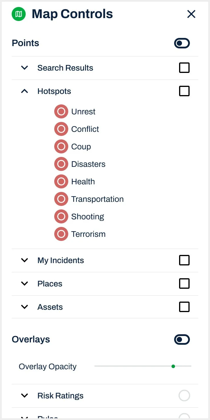
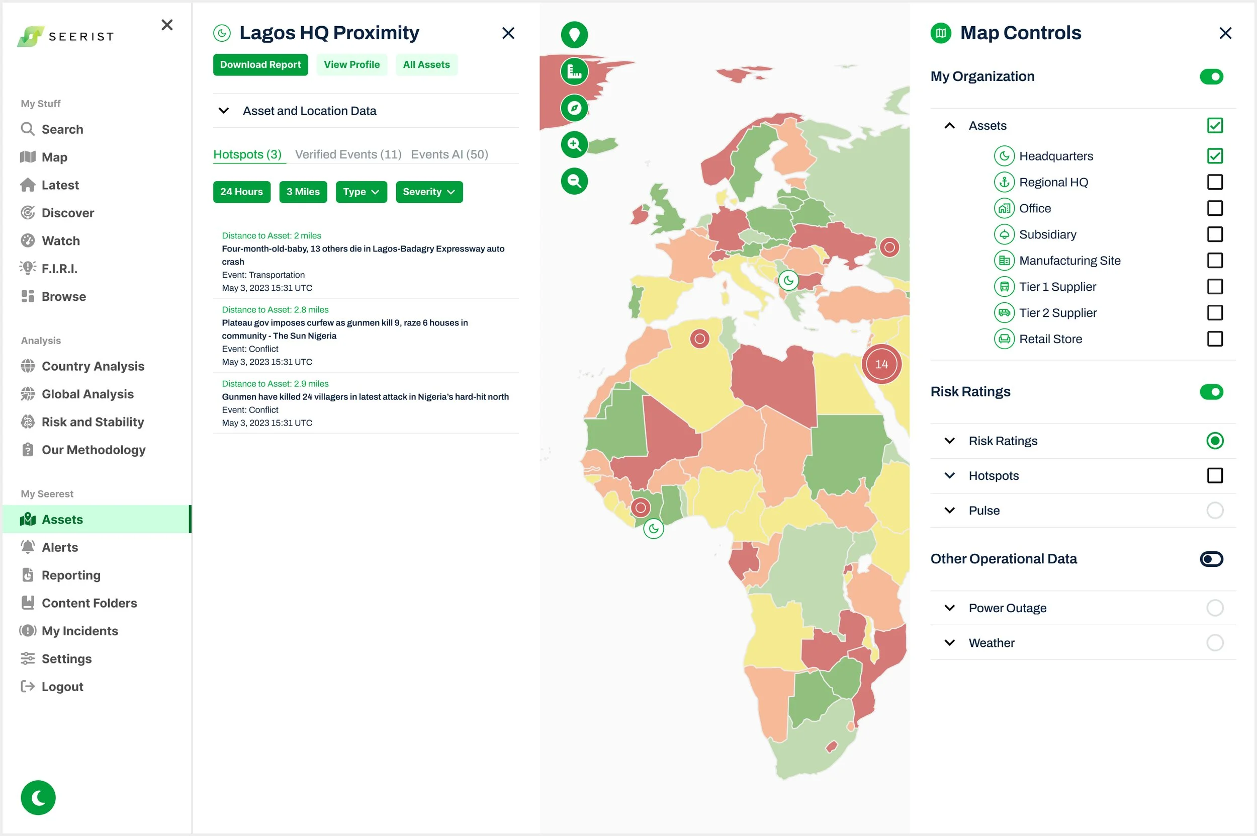
Map Controls
Role: Product UX/UI Designer
Company: Seerist
Team: Chief Product Officer, Chief Technology Officer, VP of Engineering, Head of Product, Head of User Experience, Product Manager
Duration: 3 months
Tools: Figma, Miro, Confluence, Jira

Results
The solution delivered for MVP led to a 68% improvement in user engagement.
Context
Seerist is a map-based platform, but it’s Map Controls (and map legend) were fragmented across multiple entry points, leading to user confusion, disrupted workflows, and low user engagement.
Research
UX Heuristic Evaluation
Identified critical usability violations, from hidden overlays and poor legend visibility to inconsistent overlay colors and brand misalignment
During a UX Heuristic Evaluation of the legacy product, I identified violations of Nielsen Norman’s heuristics, including Visibility of System Status, Recognition Rather Than Recall, and Consistency and Standards. In addition to meeting business requirements, technical constraints, and user needs, I ensured my design solutions adhered to UX principles to resolve these usability issues and restore user trust and confidence in the product.
Screenshots from Existing Seerist Platform

Hidden Map Toolbar
The map toolbar is hidden from users behind the Search panel.

Hidden Map Legends & Brand Inconsistency
Icon legends are only visible within their originating screens (such as Influences, a navigation item used solely for this purpose), and map overlay and icon colors are inconsistent with brand standards, leaving users unclear about what is displayed on the map.

Hidden Map Legends
Selected map overlays persist across screens without a legend for context or a way to change them, and map icons persist from old searches without feedback to the user, leaving users unclear about what is displayed.

Map Interaction Inconsistency
Maps appear on screens that don’t match the content; users must close dashboards to access the map but can’t easily return.
User Interviews
Seerist is a map-based product, but users weren’t using the map
User Confusion
“I have trouble understanding what data is actually being shown on the map, and I can’t find the legend.”
User Frustration
“I can’t figure out how to change the map because I don’t know where the controls are.”
User Personas
I developed detailed User Personas for its two primary user types based on insights from user testing, support tickets, user feedback, and stakeholder input. These personas were used to inform design solutions, ensuring the user experience was tailored to meet the distinct needs of both Analysts and Security Managers (Federal).


Define: Jobs to Be Done (JTBD)
As a Regional Security Analyst, I need a unified Map Controls menu to visualize and combine all Seerist content and data types, so I can gain a comprehensive view of my assets and the surrounding context.
As a Federal Analyst, I need to efficiently filter and toggle data layers on the map, so I can assess geopolitical threats quickly and accurately.
As a Corporate Security Manager, I need to monitor and track key assets across multiple regions, so I can make informed decisions about resource allocation and threat mitigation.
As a Seerist Platform User, I need Map Controls that remain accessible even when other panels are open, so I can continue interacting with the map without losing context.
Design Process
First Iteration
Designing seamless Map Controls access across screens to preserve user workflows
Stakeholders wanted a Map item in the left-side navigation, while the Product Manager prioritized a holistic solution giving users consistent access to Map Controls on every map-based screen without disrupting workflows. All three design options explored below addressed the two common user issues identified in User Research: intuitive access to what is displayed on the map and the ability to change map data within existing workflows.
Design Option One
A static Map Controls feedback bar across all map-based screens provides persistent visibility of active filters and quick access to map controls.
“I really like the feedback bar along the bottom of the map showing me what I am viewing on the map. IMO it could be smaller, with icons to show data types, but with an expandable view perhaps. I think at the moment it’s a little too big?”
Design Option Two
A collapsible Map Controls panel allows users to expand for detailed information or collapse to explore more of the map.
Design Option Three
Preferred by the Product Manager, the Map Controls panel is accessed via a bottom-right icon, though I was concerned that hiding this key feature behind an unlabeled icon could reduce usability, especially given existing user confusion with the legacy platform’s inconsistent iconography.
“This is absolutely brilliant! Exactly the right direction and I LOVE the integration of Map Controls with the other panels and content! Now we need to think through how the content is visualized on the map interplays with content in the panels.”
Second Iteration
Consolidating content panels to one side and testing Map Controls placement to streamline workflows
The platform had content panels on both sides, making it challenging to incorporate the Map Controls panel. This iteration explored consolidating content panels to one side and A/B testing user preference for placing the Map Controls on the left or right, as its placement could impact the content panel and overall workflow.
A/B Testing

Option A
Option B
The Product Manager chose to place the Map Controls and content panels on the right, overlapping so only one could be accessed at a time, though I flagged this as a potential usability issue for user confusion.
-
Feedback from Chief Technology Officer:
Reorganize content into Points, Overlays, and Map Base Layer. Users need to organize this way because if some content types are turned on, they turn other content types off.
Allow user to turn on or off Search Results in Map Controls. This would be a layer on the Map itself, so can’t apply filters, but could allow to overlay Map. Likes having a legend in here, but wants to keep simple. Can’t see Search Results because Assets is on.
Feedback from VP of Engineering:
Keep simple for easy to load map
Feedback from Head of Product:
Add Incidents to Map Controls
Include Power Outage and Weather for MVP
Need to figure out where Map Controls are (right or left): “I think it should be on the right, but i am open.”
What is the interaction of the Map as a menu item on the left hand menu vs on the map?
Controls should also include the layers and add the measuring tool + polygon drawing in future
Third Iteration
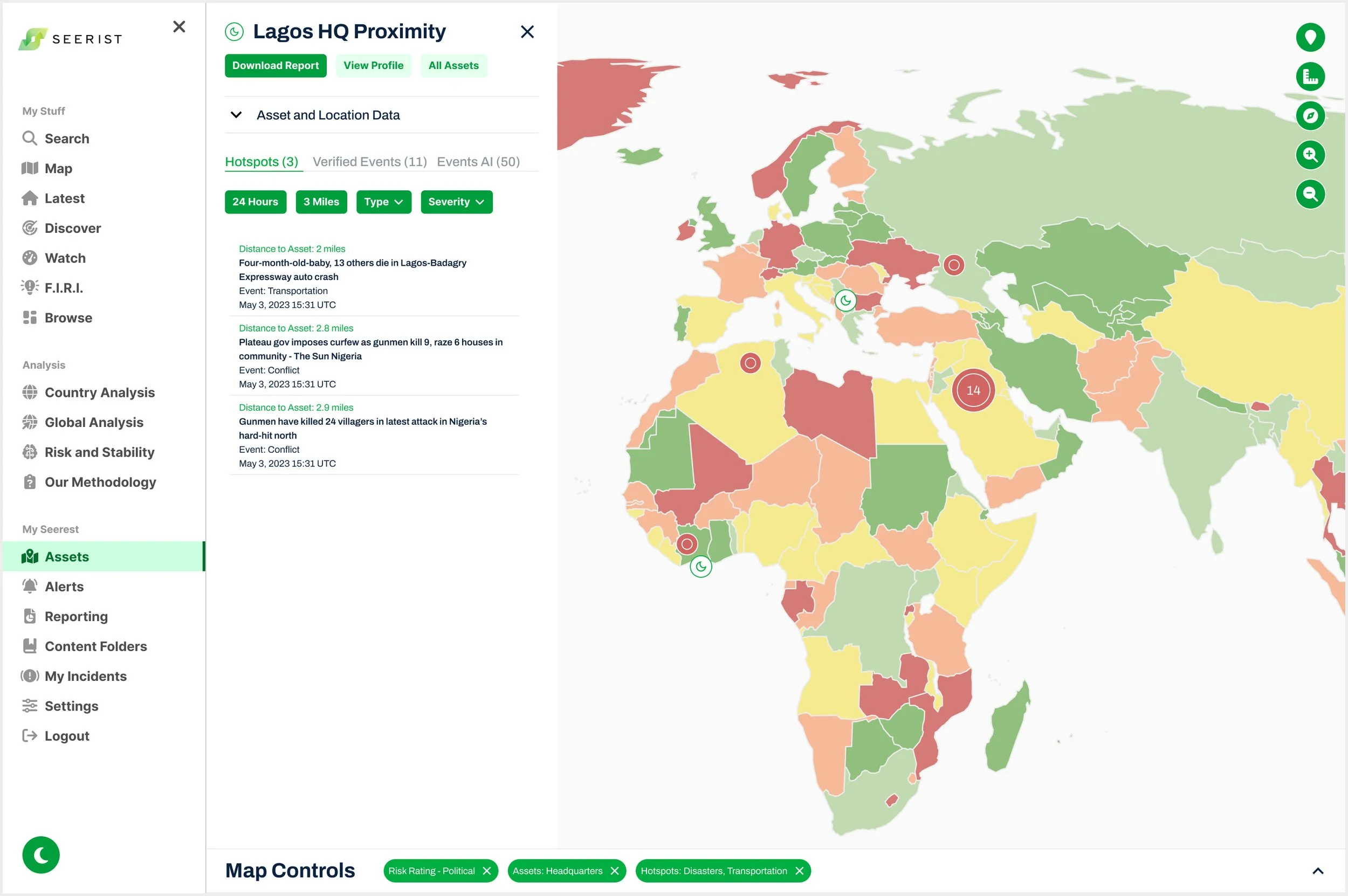
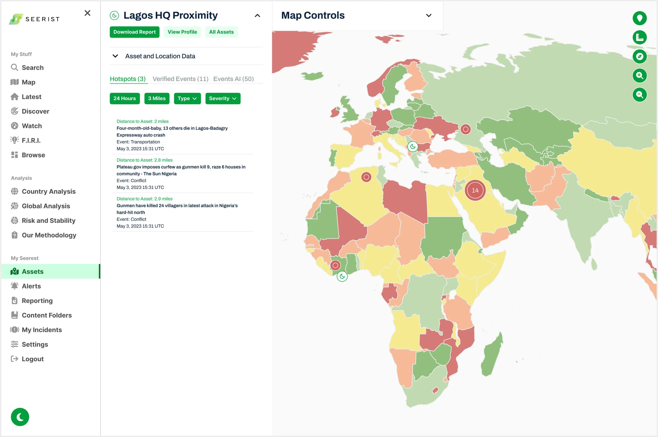
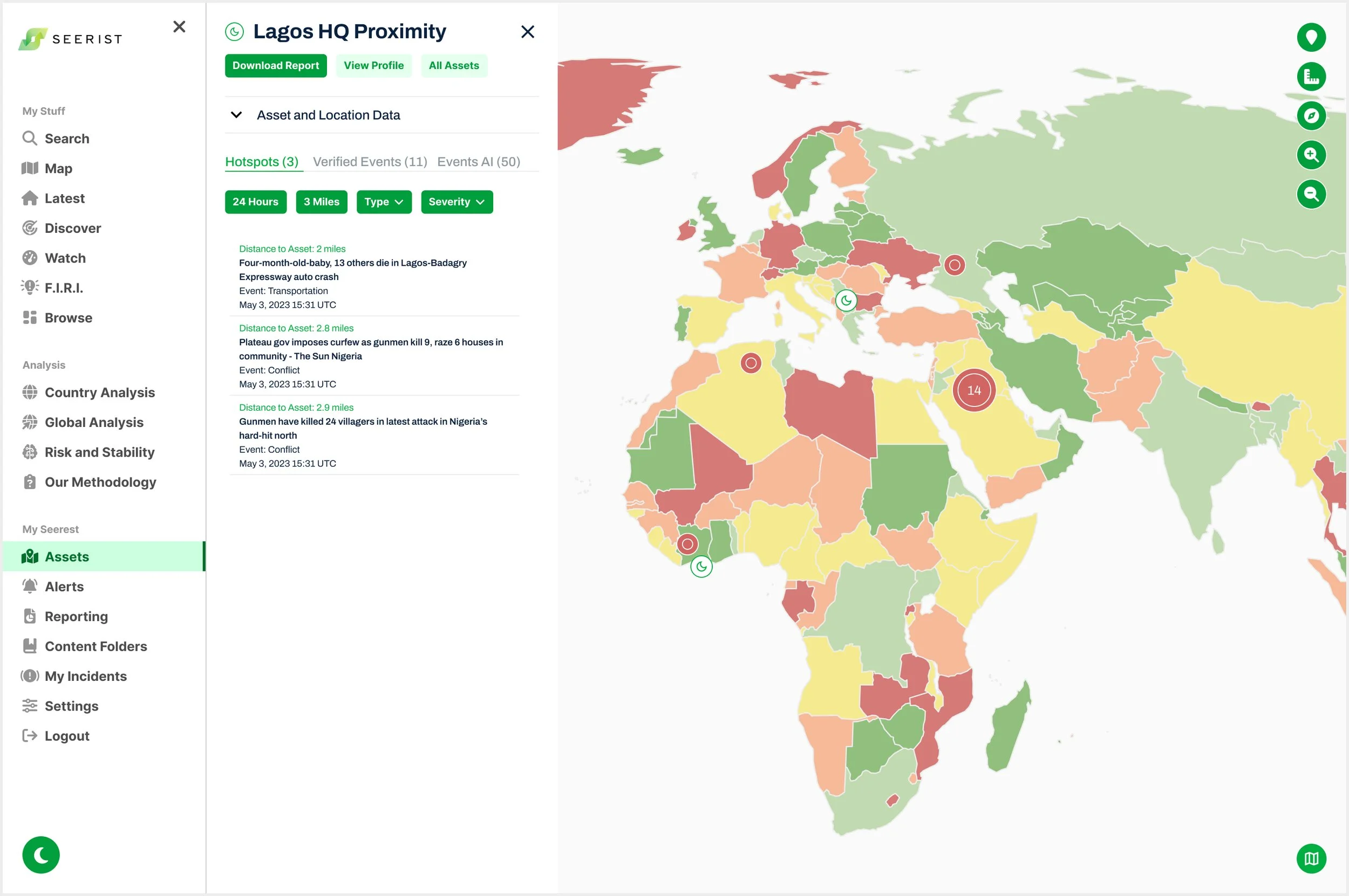
Placing both panels on the right while maintaining usability through a close icon and dynamic map toolbar
The Product Manager wanted the Map Controls panel to slide in from the right, covering content panels. I designed for high usability by adding a close icon to access the content panel, a map toolbar that moves with it to maintain visibility, and a contextual Map Legend within each dropdown to consolidate fragmented legends and provide clear feedback on selected overlays and icons.
I communicated potential confusion with hidden panels and conducted user testing.
User Testing and Stakeholder Feedback
Simplifying Map Controls based on feedback to reduce confusion and align with technical constraints
During interviews, users and stakeholders found the Product Manager’s hidden content panels confusing, and the Head of UX noted that a right-side Map Controls panel would obscure content panels and confuse users.
The VP of Engineering flagged that allowing the map toolbar to move with the content panel would be a major lift, and selecting specific Asset types was also complex, so stakeholders decided that for MVP, users could only toggle all Assets on or off.
Final Iteration for MVP
Moving Map Controls into a single left-side navigation item to balance faster development timelines
Stakeholders decided to merge all Map Controls into the left-side navigation as “Map,” removing access from each screen and simplifying the build for faster delivery. This fulfilled the Head of UX’s goal of not hiding important content panels behind Map Controls, but required users to leave their workflow to edit the map.
I flagged usability concerns about hiding the map toolbar behind panels and the non-intuitive process to reopen Map Controls. Throughout this iteration for MVP, I collaborated daily with the Product Manager and VP of Engineering and kept stakeholders informed with prototype updates to meet the original deadline.