Foreign Influence Risk Index (FIRI)Led product design for the award-winning launch of FIRI in the security and risk intelligence space for Deloitte.
Role: Product UX/UI Designer
Company: Seerist
Client: Deloitte
Team: Chief Technology Officer, Data Science Team, Development Team, Deloitte Team
Duration: 1 year
Tools: Figma, Miro

Context
To address a gap in the market for assessing foreign influence on national stability, Seerist partnered with Deloitte to develop the Foreign Influence Risk Index (FIRI), a first-of-its-kind product designed to evaluate a country's global influence using PMESII factors (Political, Military, Economic, Social, Information, and Infrastructure).
As the sole Product Designer on this project, I was responsible for the end-to-end UX/UI process. This included writing user testing scripts, conducting usability tests, and iterating on the prototype throughout the year-long development cycle. This was also my first UX project.
Results
Acknowledgments
Seerist's Foreign Influence Risk Index (FIRI) achieved "Awardable" status through the Pentagon Chief Digital and Artificial Intelligence Office’s (CDAO) Tradewinds Solutions Marketplace. The Tradewinds Solutions Marketplace has recognized the immense potential of FIRI in capturing, tracking, and analyzing great power competition activities.
Research
Stakeholder and Subject Matter Expert Interviews
Each week, I interviewed stakeholders and experts to gather insights and presented updated prototypes during joint Seerist-Deloitte meetings. Stakeholders prioritized feedback based on feasibility, focusing on the MVP. This continuous feedback loop resolved usability issues, aligned the product with user and business goals, and kept stakeholders engaged.
Define: Jobs to Be Done (JTBD)
I developed a list of key JTBD based on stakeholder and SME interviews.
As a federal analyst, I want to track how and where China’s influence is expanding across PMESII domains, so I can prioritize regions for deeper intelligence review and early threat detection.
As a regional analyst, I want to identify countries where China’s social influence is declining, so I can study resistance patterns and policy impact.
As a strategic advisor in an interagency environment, I want to synthesize influence data across adversaries and domains, so I can present cohesive, data-based policy recommendations to senior leadership.
As a data-driven decision-maker, I want to interact with clear, visual representations of complex influence data, so I can quickly translate insights into strategic or operational decisions.
As a policy advisor supporting federal agencies, I want to identify priority threat regions based on influence data, so I can recommend actionable strategies grounded in real-time intelligence.
As a corporate risk advisor, I want to brief executives on geopolitical influence risks in key markets, so I can mitigate exposure to instability or supply chain threats.
Design Process
Initial Sketch
The project started with a single-screen dashboard concept, but feedback from the Chief Technology Officer pushed us to adopt a different approach. I then designed a flexible solution offering three distinct data views: Map, Graph, and Data, aligned with the varied user needs and use cases identified in research.

Early Iteration
Based on early feedback, low-fidelity wireframes were created that moved the design away from a dashboard concept. Instead, the interface was organized around three main navigation items—Map, Graph, and Data Table—each designed to visually represent influence.
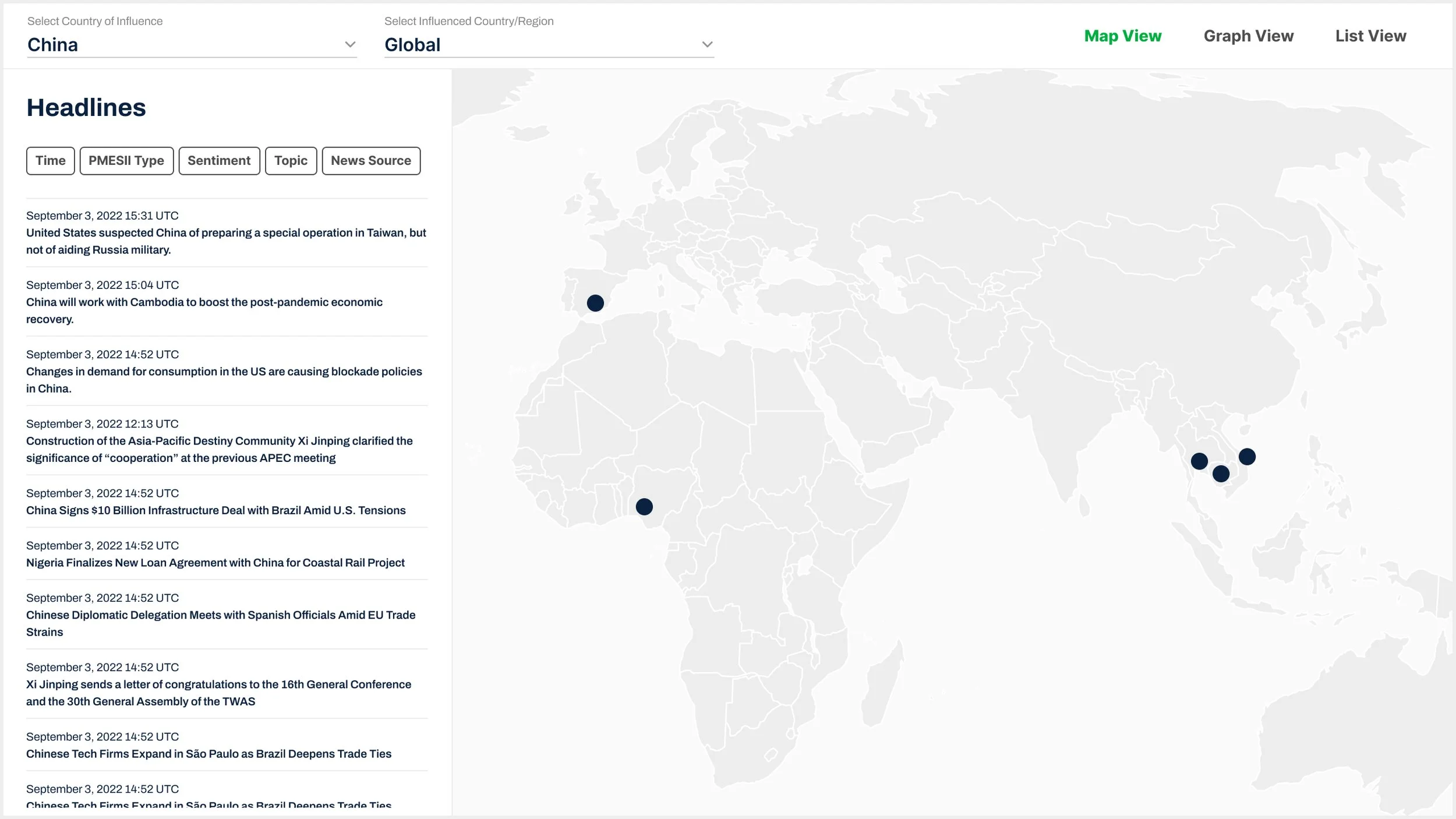
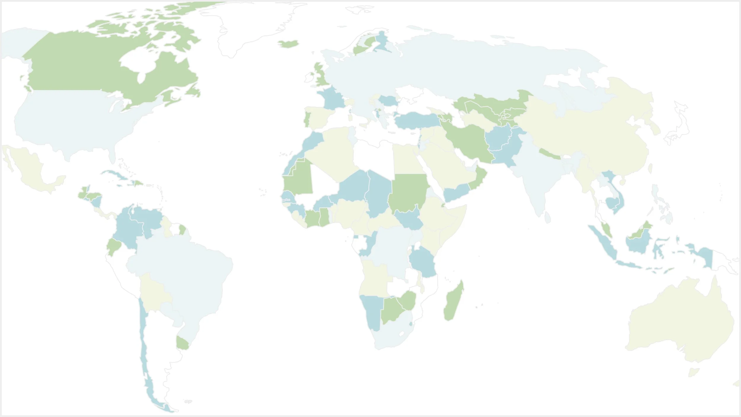
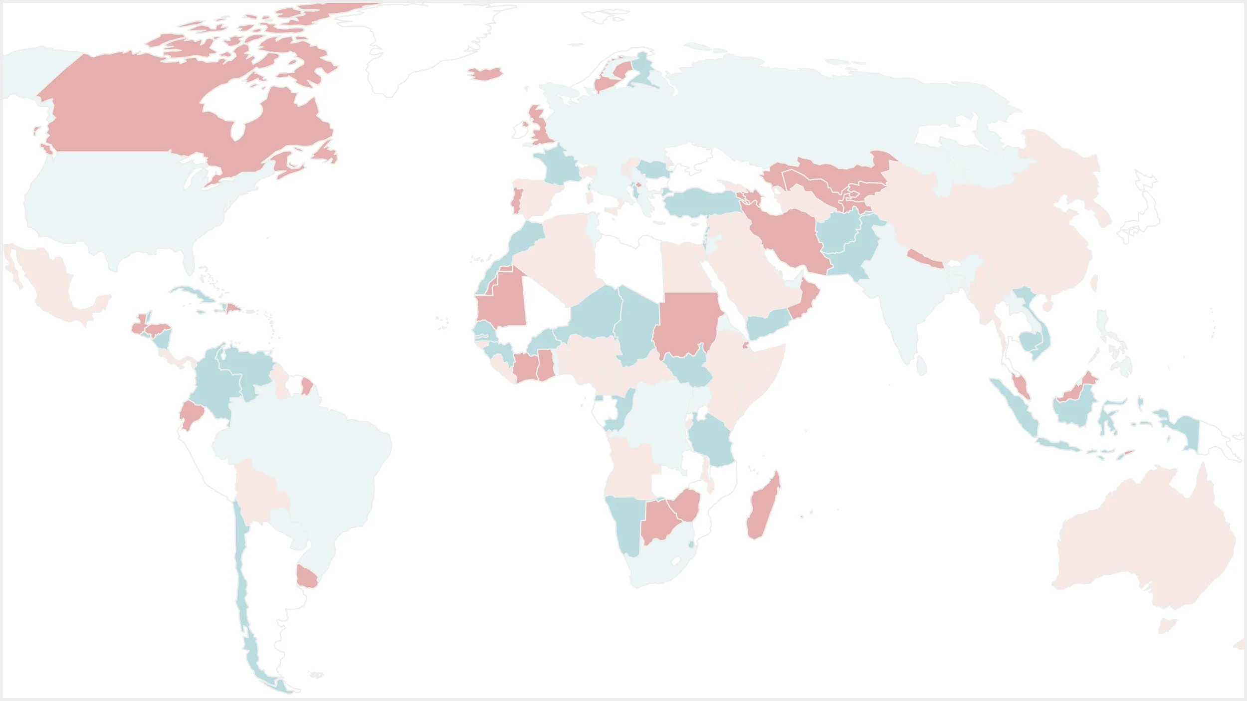
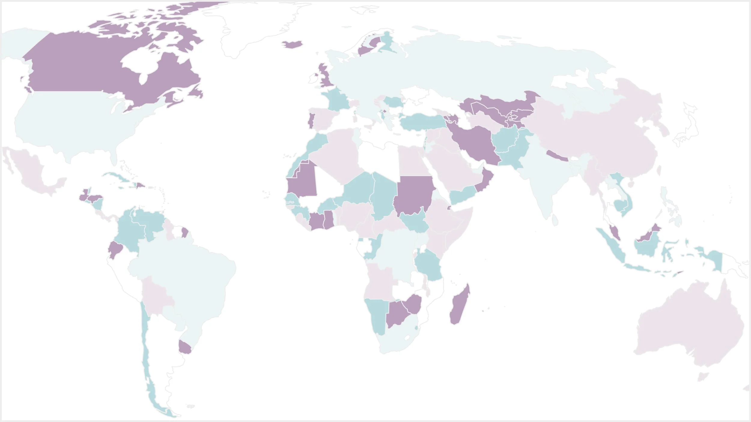
Map View
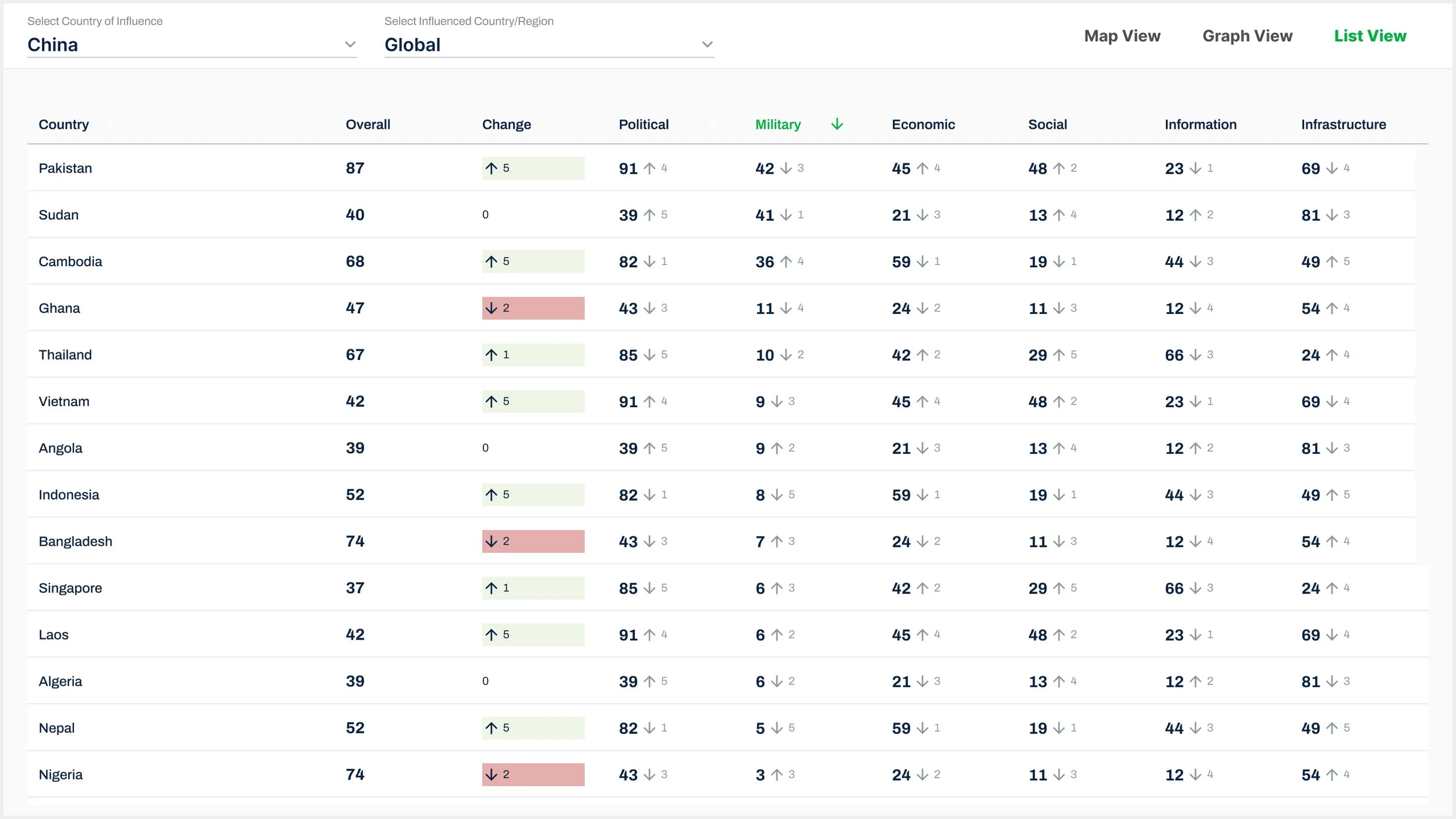
List View with Implemented Early Stakeholder Interview Feedback
Early stakeholder interviews at Seerist led to implementation of design solutions such as coloring the “Change in Influence” column to draw the user’s attention on important changes in foreign influence risks.
-
Higher ups at Deloitte do not like the radar graph.
Graph feedback: what graphs are needed and which are not.
Data Analysts provided useful feedback specifically that only bar, line, and pie charts are useful.
Data needed further back than modals provided
Heatmap over time to compare two countries
Feature for personalized polygons of interest as Seerist
Click on country would cause zoom in
Ability to click on a point in the line graph to understand what event caused that spike or drop
Time filter options: day, week, month, year
Filter persistance across all three views (Map, Graph, Data):
Time filter would be useful for map articles and graphs (not data view)
Influence scores needed on Map
Ability to see which article is selected on Map
PMESII tags for article cards
Keeping Streamlit default filters for Graphs and Data table: it was felt by stakeholders that this default feature provided more to the user.
I was concerned users would be confused by these component features as they didn’t align with the intended use of our product, but I was unable to gain stakeholder buy in on removing these because it would take more time to override in code.
Color connotation for Influence scoring
Do not use Green as it conveys “good”
Do not use Red at it conveys “bad”
What are the color connotations for those assigned for PMESII?
I delved deeply into this during stakeholder and user interviews, with resulting feedback being that there was no issue and no suggestions on the colors I assigned for PMESII.
Data Visualization: Design Exploration
Within months of transitioning into the security, threat, and risk industry, I took on responsibility for delivering data visualizations for this project. Leveraging stakeholder and SME feedback from both Deloitte and Seerist, I explored and iterated on various design solutions to effectively visualize complex data aligned with key Jobs To Be Done (JTBD).
This section provides a glimpse of graph options and does not represent the full scope of the data visualization exploration or the interactive filtering capabilities explored during this phase.


Data Science Team Feedback
The Data Science team provided feedback that bar, line, and pie charts were the most suitable visualization formats for our data.
Subject Matter Expert Feedback
Feedback indicated there was limited value in a combined graph showing the influence of all major countries (China, Iran, Russia) together. Instead, the true user need was to view each country’s influence separately to enable more precise analysis and targeted decision-making.
Mid Iteration
Challenges
Development in Streamlit
Challenge: FIRI was developed in a separate tool, Streamlit, chosen by the Chief Technology Officer for its alignment with future product goals. However, this decision introduced limitations in map functionality and component integration. Additionally, due to the delayed assignment of an engineer, early wireframe designs had to be iterated to accommodate these Streamlit constraints.
Solution: My primary focus was to ensure that usability remained a top priority and was not compromised throughout the development process, so I collaborated closely with the engineer to understand Streamlit's limitations and developed optimal design solutions that balanced usability within these constraints.
Streamlit Screenshots

Map View

Graph View

Data View
Usability Challenges with Streamlit’s Default UI
Graph View
Streamlit’s default UI components introduced significant usability challenges. Graph types were presented within collapsible cards in the left side panel, which confused users. Even with a “Select” button added, the collapse behavior couldn’t be disabled, and there was no clear visual indicator to confirm selection to the user. Additionally, filters had to be embedded inside each card, causing users to misinterpret the panel as a set of filters for a single graph rather than a menu of graph options.
Data View
Streamlit’s default filters for tables and charts offered little user value and disrupted key workflows. I recommended removing them to simplify the interface, but the engineer chose to keep them due to technical constraints and the belief they added value.
Since this violated a UX Heuristic, I conducted usability testing on user completion rates (see next section).
Nielsen Heuristic: Aesthetic and Minimalist Design
Interfaces should not contain irrelevant or rarely needed information. Every extra unit of information competes with the relevant units and diminishes their visibility.
Usability testing revealed that these default filters consistently caused confusion and hindered task completion. I used this data to build stakeholder buy-in for their removal.
User Testing
Overview
I specifically interviewed users who were using the platform for the fist time because I wanted to understand the design usability from two aspects:
Intuitivity
Learnability
I tested three User Flows that were centered around key user workflows in which I had usability concerns.
The users were selected by Deloitte.
Ten users were interviewed and tested.
The six users with relevant backgrounds to the users were used for Affinity Mapping to track trends.
All User Testing Feedback was communicated in the weekly stakeholder meetings with implementation suggestions in order to collaborate on solutions across teams.
Script for User Testing
User Flow 1: “You want to know which countries China has the least influence. Using the Graphs, please find which countries China has the least Influence.”
User Flow 2: “You want to know which countries China has had a change in influence. Using the Data table, please find which countries China has had the most increase in Influence.”
User Flow 3: “You would like to know which country China has the most Political Influence on in the world. Please find which country this is, and what China’s Political Influence score is on it.”
Since I specifically tested on users who had never seen the product, in the first two questions, I tell them which section of the website I’d like for them to find the data, so I could understand if those two sections had usability issues. For the third question, I didn’t tell them where to find the data, to see how easily a first-time user could navigate the website.
Summary of Results
The product had low usability in regards to being intuitive for first-time users.
The product had high usability in regards to learnability as communicated by the first-time users.
User Feedback
After conducting user testing, I organized feedback in FigJam using sticky notes, with each user assigned a color.

Affinity Mapping
I then organized this user feedback into categories to identify trends and inform product design.
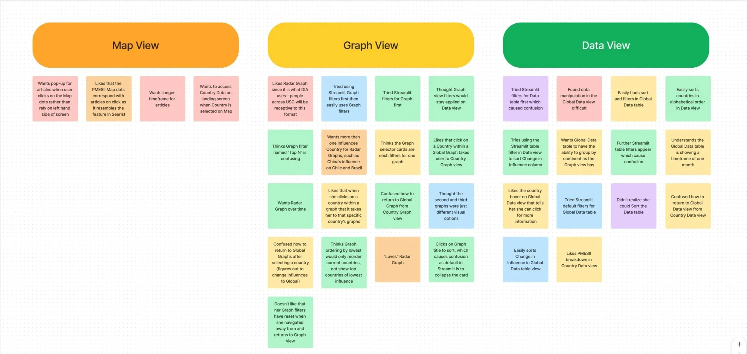
User Testing: Turning Research Trent Insights into Product Solutions
Map View
User expected interactions
Hover: Influence Scores
Click: various feedback from users on expectation (score transparency, zoom, and country data)
My concern for taking the user to Country Data was the confusion trend when taking the user from their current work. Possible solutions:
Open in new tab
Open pop-up
Split screen view: a couple users wanted a split screen to see Map and Data views at the same time (initial dashboard concept)
Graph View
Graph selection
Limitation within Streamlit on conveying to the user which Graph is selected (can’t manipulate card design). Also, there is no ability in Streamlit to collapse the Graph cards not in use when one is selected.
Suggested solution is to update the hierarchy of the graph titles on the cards to convey to users that there are multiple graphs, which was implemented.
Suggested solution is to add a Select button onto the cards, which was implemented.
Radar Graph: while many stakeholders didn’t like the Radar Graph, it was so popular with users, that it was the only graph constantly receiving praise. I used this information to gain buy in from stakeholders on keeping it, but to also add the variations users requested:
Over time
Country comparisons
Graph filter names assigned by the Data Science team caused a usability issue. I suggested filter naming conventions that adhered with outside world connotations, which was implemented.
Data View
Data manipulation options need to be more obvious: since there was usability issues for the users being able to understand how to find information due to confusion around Streamlit default filters and sorts within the Graphs and Data table, I was able to communicate this issue, and gain buy in from stakeholders that rather than providing more to the user, it actually caused confusion, and thus users were unable to accomplish user flow goals. I suggested we remove these default filters, which was implemented.
Data table sorting feature: with removing the Streamlit default sort and filter features, I suggested we add a column title highlight and arrow to not only indicate which column is being sorted, but the location for our sort feature. I retested this solution with other users, and they now easily understand how to sort the Data table.
Data: Country Select
Since this was my first work experience UX project, I struggled with intuitive navigation. Users intuitively wanted to be able to click on a country within the Global Data view, and be taken to that specific Country’s Data view, but were confused on how to return to the Global Data view. The solution provided to add an information icon into the top navigation, so users could access this without confusion on being taken to a different aspect of the site, proved to be a solution follow-up users were happy with.
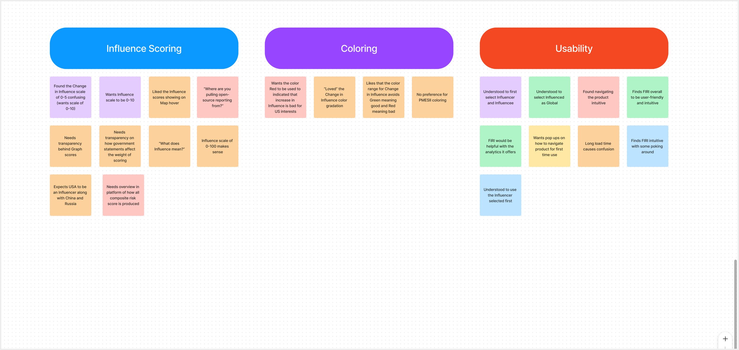
Influence Scoring and PMESII Methodology
For transparency and weighting of Influence scores: the trend was that various users wanted access to this information on different views (Map, Graph, Data). For users who brought up this issue, I also asked them were they would expect to find this information to gain insight. I pulled the trending feedback, and suggested a design solution of adding an information icon into the top navigation bar, so users could access this information from any view (Map, Graph, Data), which was implemented. Follow-up users were now able to quickly find this information.
Users were confused by a Change in Influence scoring of 0-5, and unanimously preferred a scale of 0-10. This was implemented.
Coloring
Color connotation: I delved deeply into this during stakeholder and user interviews, with resulting feedback being that there was no issue and no suggestions on the colors I assigned for PMESII.
Usability
Work flow starting point: users were often confused thinking they had to start their workflow on the Map view because it was the landing screen. Users tend to feel like they need to start with the Map, which caused me to question which view should be the landing screen (and first view in top navigation order).
I noticed this was only a issue for first-time users upon initially using the product, and not an issue once they were ten minutes into using the product.
This information was presented to stakeholders, and it was decided not to make any changes to design.
Filter persistance across views (Map, Graph, Data)
Some users expected their filters to persist, either from one view to the next, or when returning to a specific view at least. This was the reason and intention for the initial conceptual wireframe for a dashboard.
This information was presented in collaboration and stakeholder meetings to understand Streamlit limitations and final stakeholder decision for MVP.
Future Influencer Countries were added as greyed out in dropdown to convey to users that more Influencer Countries were coming.
A/B Testing
The Director of Data Science raised a concern about potential color connotations used in the map view and for PMESII factors, particularly given the sensitivity of color meanings within the security, threat, and risk intelligence space. To explore this, I conducted an A/B test comparing three different color schemes and gathered feedback from both users and subject matter experts. The results revealed no strong preferences or negative associations. This indicated that color choice did not impact user interpretation in this context, supporting continued use of the existing palette.
Option One
Option Two
Option Three
Mockups for Marketing
I collaborated closely with the marketing team to develop mockups for marketing materials, working under tight deadlines to ensure they were ready for upcoming conferences in the security, threat, and risk industry.


FIRI One Pager

FIRI Two Pager: Page One

FIRI Two Pager: Page Two
Retrospective
As my first project as a Product UX/UI Designer, I’m not fully satisfied with the wireframe design. Revisiting it now, I would redesign the wireframes to better align with UX heuristics and Seerist’s updated UI guidelines for consistency. I would also use a light background for the Data View, as there was no usability reason for the original dark background, and ensure the Map coloring meets WCAG accessibility standards.

Map View

Data View