Design System
Role: Product UX/UI Designer
Company: Seerist
Team: Head of User Experience
Duration: 1 month
Tools: Figma, Confluence, Jira

Context
With the addition of a new Head of User Experience, I was responsible for contributing to a Design System in Figma as part of his platform-wide redesign of Seerist, by designing standardized solutions for key platform components:
Share
Export
Location Select
Filters
These features were often hidden or difficult to access for users, presenting UX Heuristic issues, which I identified through a UX Heuristic Evaluation. I addressed these issues to improve usability and ensure consistency in both their location and language across the UI.
Results
30% reduction in QA issues
15% decrease in time-to-market
-
Universal pattern for all things. Always variants need to accommodate. Start with basic, and can add on. Can explore edge cases you find.
Preferential: common/universal paradiagmns. Focus on interaction. Several over work flow.
Share Component
The use case will be for emailing a specific Seerist page to someone.
There is no pop up designed yet in component library.
Can be a menu or pop up.
Not inviting people
Export Component
Consolidate all use cases for Export in Seerist into one design solution
Determine the functions for export.
This feature will include Download Report, Copy, Download PDF or Word, etc.
Location Select
Inconsistency of geography selector component across platform
Need a better Country selector widget. Essentially something like what is in Risk and Stability from Regions downward.
Doesn’t like selector used for Country List.
Likes Watch dropdown the most, but not good enough. Latest is also a different selector component.
Want something like Mac Search: results are auto grouped by Country, City, Port, Water.
When user starts to type, autocomplete.
Design solution can be a dropdown or modal or something like Mac Search.
Default to local (nearby) Geography
Ability to quickly switch between Geographies
Filters
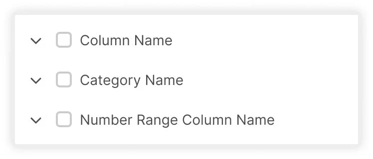
I need a prototype showing a small menu with two to three inputs inside:
“Field” Dropdown: opens with a list of items that says “Column Name”, “Category Name”, or “Number Range Column Name”
“Value” Dropdown
If the user selects “Column Name” then only should only see one value field.
This dropdown menu should open with a list of items that says “Row Value.”
These should be multi-select with checkboxes.
I need a variant that shows the following:
“Category”
If the user selects “Category Name” from the Field dropdown then another dropdown menu should appear labeled as “Category.”
This dropdown menu should be placed in between Field and Value menus.
This dropdown menu should open with a list of items that says “Category Name.”
I need a variant that show the following:
“Range”
If the user selects “Data Column Name” then two text fields should appear, side-by-side, that state “Min” and “Max” ranges.
These should replace the value dropdown.
Research
UX Heuristic Evaluation
Screenshots from Existing Seerist and Seerist Core Platforms
I conducted a UX Heuristic evaluation of Seerist and Seerist Core to track all use cases for Export as they existed in the product.

Screenshot from Seerist
Custom Reports are found within Reporting navigation item

Screenshot from Seerist
Export feature labeled “Country Report” and “Capture Screenshot” hidden within “Actions” (inconsistency with next screenshot with icon used instead)

Screenshot from Seerist
Export feature labeled “Country Report” on Risk & Stability

Screenshot from Seerist
Export feature labeled “Copy All” on Global Issues Dashboard

Screenshot from Seerist
Export feature labeled “Copy all events to Clipboard” (hidden in icon) on Search

Screenshot from Seerist Core
Export feature labeled “Download” on Risk Rating
Nielsen Norman Usability Heuristic Violations
Consistency and Standards: Inconsistent language use throughout the product causes confusion.
Match Between System and the Real World: Export functionality does not behave like expected export features users are familiar with.
In addition to these Seerist uses of and issues with export, Seerist Core offered a download feature for downloading a Country Report, which didn’t exist in Seerist. Since users were being brought over permanently from Seerist Core to Seerist, this feature needed to be implemented and considered with this new export feature.
User Research
I conducted User Research with both Seerist and Seerist Core customers. Some common feedback I received was:
Share and Export
I was working in Global Issues Dashboard and wanted to export a report, but I couldn’t find the Country Report button in the top right that I use in Risk and Stability to Export data.
Sometimes export is under ‘Actions’, other times it's just an icon. I never know where to look or what the export will be called.
I contacted my CSM because I couldn’t find an export option in Search. I needed to pull that data out. It was frustrating to learn later that there actually was a ‘copy all events to clipboard’ feature, but it was hidden behind an icon, so I had no idea it existed. If it had been a button like it was in Global Issues Dashboard, I would’ve used it months ago.
When I’m in Risk and Stability, I can export a PDF with just one click, but in Search or Global Issues, all I get is a ‘Copy All’ option. I don’t want to copy data. I need a report I can share with the Head of Global Security.
In Seerist Core, it was so easy to find the yellow ‘Download’ button. Now in Seerist, I have no idea where to find that same export. Everything feels hard to find or renamed. I don’t understand why they shut down Seerist Core. It worked better for what I needed.
Location Selector
I always know exactly which country I want to check, but having to endlessly scroll through a long list every time wastes so much time. Why can’t I just type and search for it quickly?
It’s confusing that sometimes I pick a country from a panel on the left, and other times I have to dig through a dropdown menu.
There’s no search option for locations anywhere. When I have dozens of countries to look through, scrolling is really frustrating.
Sometimes I need to see data for a city or a port, but I can’t select those here like I used to in Seerist Core. Now I’m stuck only choosing countries, which limits my workflow.
Seerist Core had a simple top nav that let me pick Country, Waters, City, or Ports quickly for viewing data. The Seerist platform feels overwhelming and less flexible.
With these users and their feedback in mind, my goal was to make this new Share and Export feature as intuitive for users as possible by abiding to UX Heuristics.
First Iteration
Share and Export Components
During the UX Heuristic evaluation, I considered all possible use cases to find a design solution for sizing that could be consistently used for all components.

Share Component
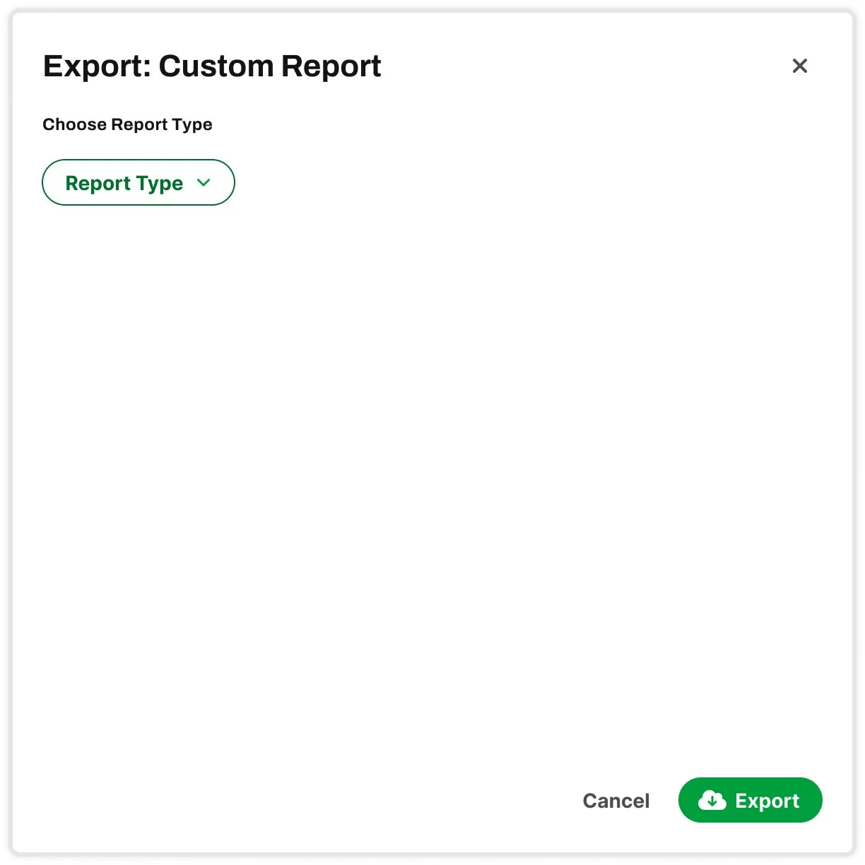
Export Component: Custom Report
To design a solution that could be used for all Custom Report types (from Reporting in current Seerist), I made a modal with an initial drop down, that once selected, progressively populated the modal with further drop downs relevant to the user selection.

Export Component: Country Report
My initial intention was that when a user selected Export from a specific page, such Nigeria within Country Analysis, the filters/selections of that page would be the default selections on the component that opened, so the user would not need to select Nigeria again. The user would still have the option to change these selections before exporting.
These design solutions resulted in two questions:
Can users export the filters applied on the page?
Answer from the Head of Product: Filters applied to screen would export also. Filters applied on screen will apply to Share and Export.
Where should Custom Reports be located?
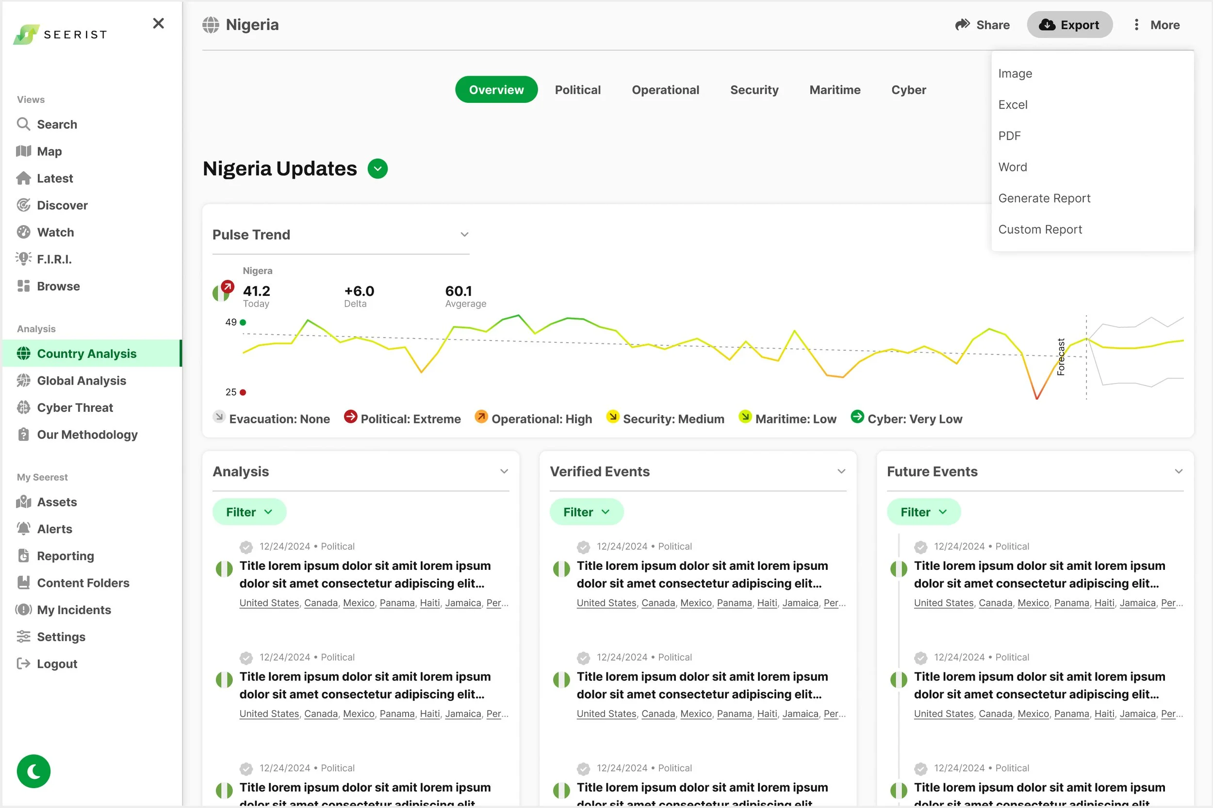
Answer from the Head of User Experience: Make the Export button a dropdown to allow users to select export options before getting to the modal. Include options such as: export as PDF, Word, and the last being Generate Report and Custom Report.
Initial Export Type Selector Dropdown
Based on this feedback from the Head of User Experience, a dropdown is added to the Export button for the user to select export options before the appropriate modal appears.
When the Export button is selected, the state changes to provide feedback to the user that they have selected Export and are viewing Export options.
Location Selector

Option One

Option Two

Option Three
Feedback on Options One and Two was provided by the Head of User Experience, recommending an option that the Location Selector display nearby locations first upon opening, followed by a scrollable list of all locations.
The Search function/icon was moved into the Location Input field component above (not shown).
Feedback from Head of Product:
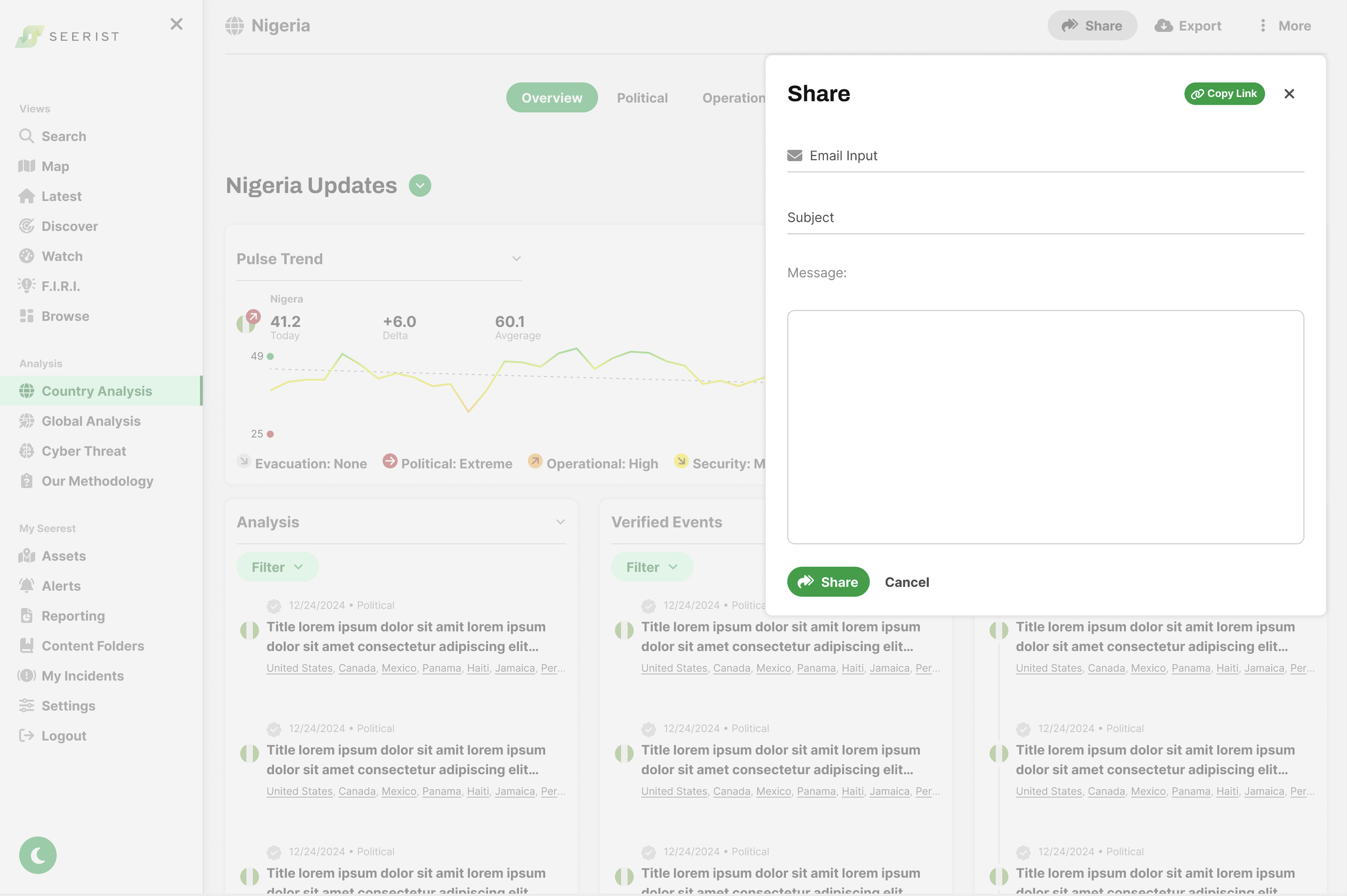
Share Component:
Add Subject to Share Email modal
Like the “Copy Link,” but change from Text button style to Primary button style.
Developed a consistent paradigm for button order and alignment to be implemented
Primary button first (Share first then Cancel)
Align buttons to left
Export Component:
Like how deep your evaluation went
Works for Reporting
Create a dropdown for Export options
Export Component:
Organize into categories
Export Options: Image, Excel, PDF, Word
Download Report: Generate Report, Custom Report
Final Iteration
Share Component
Share Component: Initial

Share Component: User has clicked on the Email Input field
Export Component


Location Selector Component

Option One

Option Two