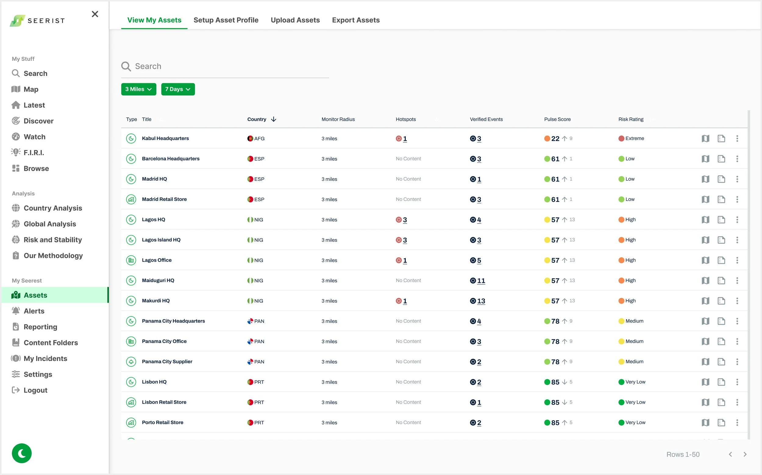
Asset Dashboard
Role: Product UX/UI Designer
Company: Seerist
Team: Chief Product Officer, Chief Technology Officer, VP of Engineering, Head of Product, Head of User Experience, Product Manager, Data Science Team, Development Team
Duration: 3 months
Tools: Figma, Miro, Confluence, Jira

Context
Seerist migrated a critical, fragmented Assets feature from the sunsetting Seerist Core platform. I launched a unified Asset Dashboard that improved usability, consolidated threat and risk intelligence data in relation to a user’s assets, while meeting business and technical requirements and maintaining uninterrupted access.
Results
The Asset Dashboard delivered for MVP improved retention for enterprise clients by 9%.
Initial Requirements
Provide wireframes based on the following requirements and on Miro sketches.
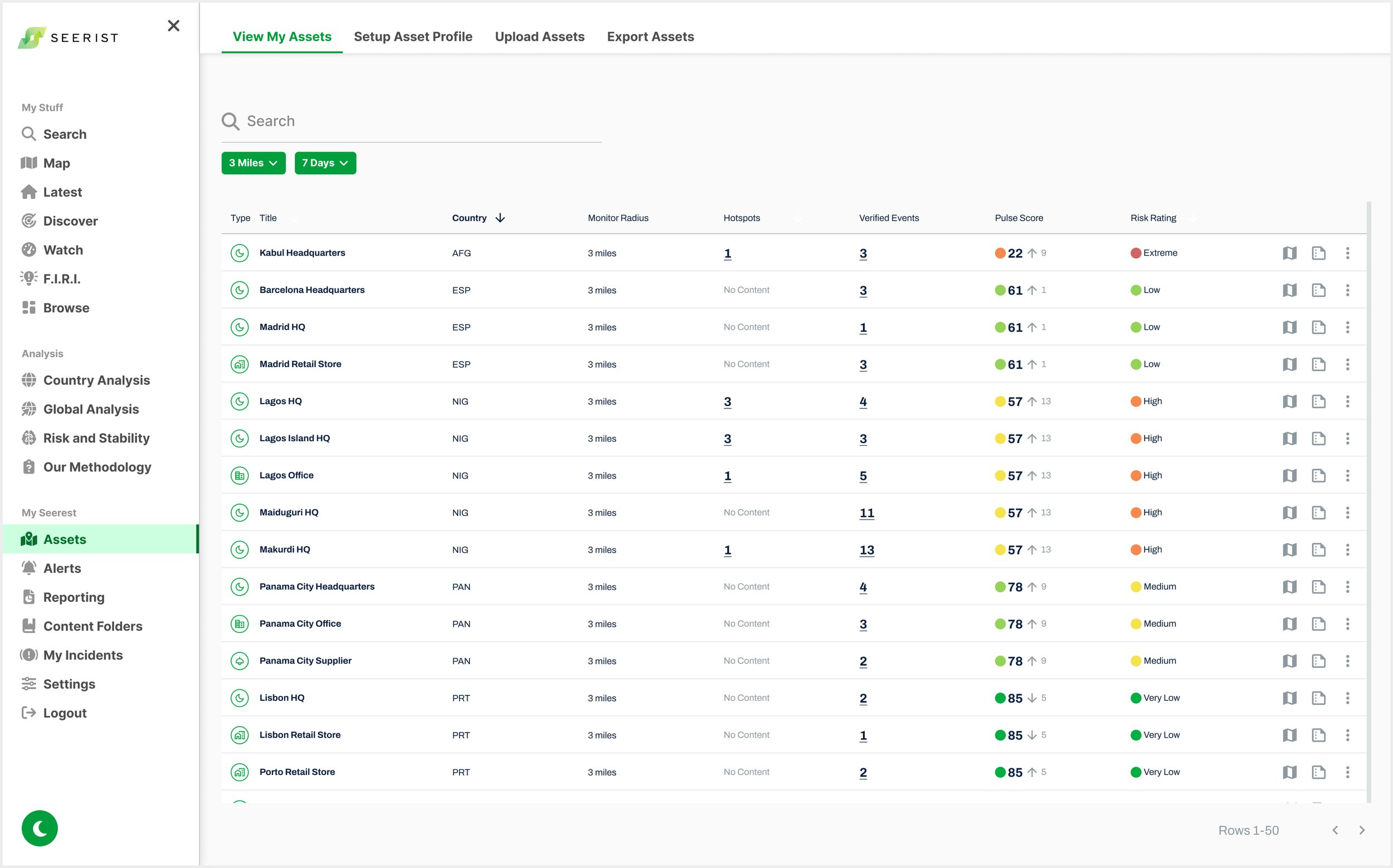
Remove Custom Field columns to remove horizontal scroll. Custom fields on horizontal scroll was originally a feature for the Beta version that the Head of Product required. The Product Manager wanted to move this feature to an Asset Profile pop up.
Provide filters within table column headers.
Provide function that allows user to view a specific Asset on a Map with nearby Hotspots and Verified Events.
Provide a Back button from Asset on Map back to Asset Dashboard.
Research
UX Heuristic Evaluation
Identified critical UX issues, including inconsistent iconography and branding, confusing Asset-to-Map interactions, and inaccessible dashboards that disrupted workflows
I conducted a UX heuristic evaluation of Seerist Core and the Beta in Test Mode, identifying issues such as multiple ways to access Assets on the Map that required closing the Asset Dashboard with no clear way to reopen it, as well as inconsistent iconography, layout patterns, and branding, for example, Asset Type icons not using Seerist brand colors.

Screenshot of Asset Dashboard in Beta from Existing Seerist Test Mode
User Interviews
Users struggled to find asset-specific threat intelligence and manage overwhelming data, slowing workflows and causing frustration
User Frustration
"Finding the threat intelligence data affecting my asset takes too long and gets frustrating when I’m on a tight deadline."
User Overwhelm
"I need all the data on the platform, but seeing it all at once is overwhelming and makes it hard to find what I need."
User Personas
I developed detailed User Personas for Seerist’s two primary user types based on insights from user testing, support tickets, user feedback, and stakeholder input. These personas were used to inform design solutions, ensuring the user experience was tailored to meet the distinct needs of both Analysts and Security Managers (Federal).


Define: Jobs to Be Done (JTBD)
As a security lead, I want to quickly see which assets are experiencing the highest number of nearby events, so I can prioritize investigation and mitigation.
As an analyst, I want to click into an asset and view a timeline of nearby threats, so I can understand the pace and trend of activity.
As a regional security manager, I want to visualize hotspots near my sites on a map, so I can understand geographic clustering and proximity.
As an operations leader, I want to export a report that shows threats near a specific asset or region, so I can brief stakeholders or inform policy.
Additional JTBD focused on alert configuration and asset-specific threat discovery were addressed through the Notifications and Assets in Search projects.
Design Process
Early Iteration
Reduced cognitive load by applying progressive disclosure and implementing consistency to streamline complex data interactions and support faster decisions
To reduce cognitive load and apply progressive disclosure (Nielsen Norman: "Recognition over recall"), I added a hover tooltip for Pulse and Risk Rating values, allowing users to view all types without cluttering the table.
Clicking on Hotspot or Verified Event numbers now opens a Reading Panel on the right, leveraging an existing platform pattern for consistency and user confidence ("Consistency and standards"). To signal interactivity, I underlined these numbers ("Visibility of system status").
In response to feedback, I proposed offering in-context access to Alert settings via a pop-up, rather than replicating the full Notifications screen. This prevents workflow disruption and minimizes overwhelm ("Flexibility and efficiency of use" and "Minimize user memory load").
Desktop: Dashboard View Wireframe
Desktop: Map View Wireframe
To align with the use case that user’s want to view events affecting their Assets, I added a feature proposal to add “Distance to Asset” within Event cards.
Native Mobile: iOS
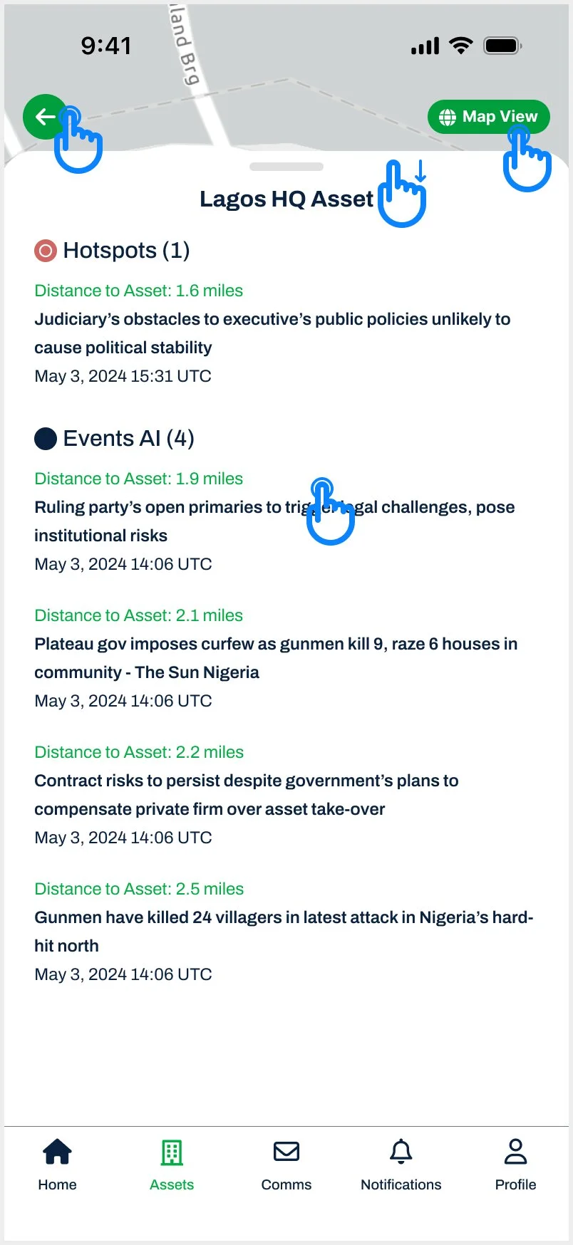
The Asset Dashboard is streamlined for mobile by focusing on the core JTBD: “What nearby events are affecting my Assets?”
I created wireframes to integrate Assets into the native mobile app MVP, enabling users to quickly identify nearby Hotspots and Events in List and Map Views and access threat details via a swipe-up modal aligned with product patterns.
I streamlined the mobile Asset Dashboard to focus on the core JTBD: “What nearby events are affecting my Assets?” Assets were grouped by Country (alphabetically), and custom fields (desktop feature) were removed to keep the interface lightweight. Users can now easily access key information like Pulse and Risk Rating per Asset.
Where possible, interactions and UI patterns were kept consistent with desktop to ensure a seamless and intuitive cross-platform experience.
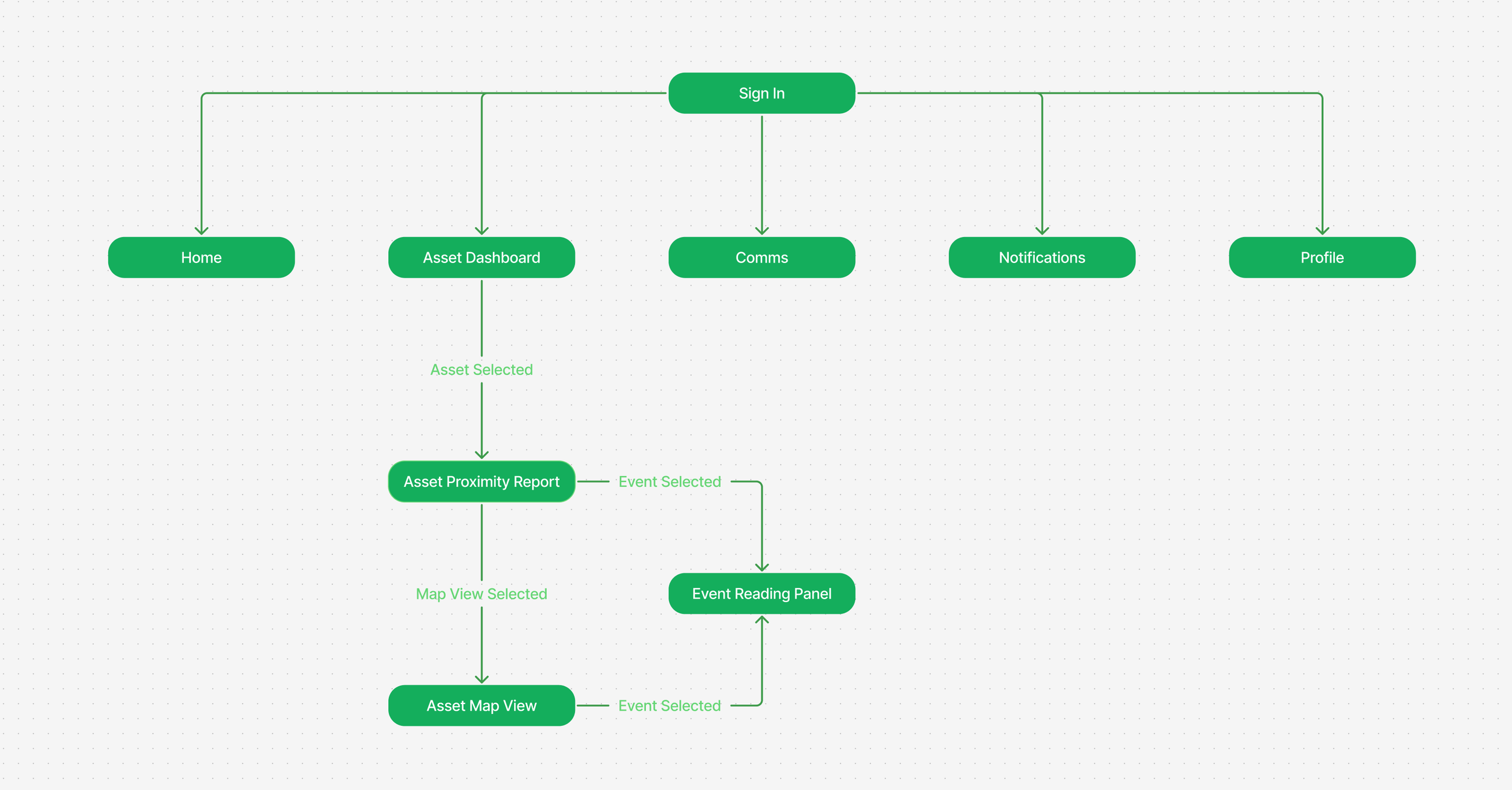
Mobile User Flow

Asset Dashboard

Asset Proximity Report

Asset Map View
Event Reading Panel
Navigation & Workflow Considerations
How clear is it to users that clicking an asset leads to the Asset Proximity Report?
How can users easily switch to another asset from any point in their workflow?
The modal pattern will be reused for Event selection. How should users return to the Event List from an Event screen? A “Back to Event List” button inside the modal is one option, but placing it near an existing top-nav back button may cause confusion.
What is the best navigation pattern to help users move efficiently between screens in the asset workflow?
“This is looking SO good! ”
-
Feedback from Product Manager:
Need to consider what clicking on the different content sections would do - where do we take the user to view more about Pulse?
We need to think of how we can configure:
Proximity
Time
Perhaps we can show it within the table - it is either 'Default' or 'Custom', with the value also shown. Let's explore that in future. I will note down a talking point for our meeting on Thursday with stakeholders to discuss monitoring proximity from time and location perspective. Verified Events would show 3 days of data as default. In further iterations, we can then make time and location proximity customizable.
How do we align this with alerting, so that user can match the Assets page with how their alerts are set up for each asset? IMO the Assets page should be an extension of the alerts that have been created for those assets, and it should be possible to customize alerts for each asset from the Assets page.
I'll put a talking point in our meeting on Thursday for this. If we link into the existing Alerts set up, then we don't need to start scoping out a new Alerts flow in this body of work.
Last question on this: not sure if this information is available or helpful for user, but instead of just Risk Rating from Asset table, we could show all Risk Ratings for Country (Nigeria): Political, Economic, etc?
Feedback from Head of Product:
Customers need to be able to see all Risk Rating types, not just the overall score.
The filters for Proximity and Time are irrelevant. The Proximity is set for each Asset by the customer when they set up their Notifications. Time for Hotspots is always 24 hours, and Time for Verified Events is set for each Asset by the customer when they set up their Notifications.
Pulse and Risk Rating information needs to be shown in the Asset Proximity Report for customers when they are in the Map View.
-
Feedback from Head of Product
Filters for Time and Distance: VE and Hotspots (not Pulse or RR) shouldn’t be above table if not applied to all header content types.
Hotspots only live for 24 hours. Only need within VE. Pulse time filter.
Pulse increase: take to Pulse page (on table, not just from Asset Map). It is on Latest, so not big lift.
If there is a narrow distance, there might not be Hotspot or Event results.
Response from Product Manager
Is there a way we can link Hotspots to Assets aside from Distance? Location isn’t only factor that conveys relevance.
Hover label on icons.
Users forget Asset Types, so take away Asset Type.
Feedback from Head of User Experience
Info hierarchy: mirror.
Keep Asset widget to right consistently.
Build new pattern while using same components that applies across product. Build UI systems to use/reuse to reinforce consistency.
Feedback from Chief Product Officer
Need feature on Asset Dashboard to sort by Risk Rating level because Risk Rating Dashboard won’t have this feature.
If Nigeria’s Risk Rating changes from High to Extreme, we need to show when this change happened (date of change or high for 6 years).
Nature of Hotspot (bomb important more than amount). Human from Analyst team would need to designate significance. What is at the top of the list of Assets: which Asset has the most Hotspot or Event severity?
Response from Head of Analyst Team
Too many icons on Asset Dash. High Severity Hotspot/Events should be colored differently to convey severity: White (nothing), yellow (close), red (massive). Simplify for users on what Assets to start with. Don’t need before and after rating because these change quickly.
Use case for Asset Manager: When do I need to care? Where does the user need to draw attention day to day. Consult Data Science on what models can be used.
Priority is that we do not design by engineers, and we do not design by committee.
Too much variety in the table header actions. If we have a huge amount of space wasted at the top of the page, why are we trying to cram filters into the same place as sorting and time/date controls.
A/B Testing
Validated design direction through A/B testing, removing unnecessary icons to reduce clutter and improve workflow focus
The Product Manager wanted flag icons in the Country column and icons in the Hotspots and Verified Events columns. I raised concerns that the Hotspots and Verified Events icons could be unnecessary, lacked workflow relevance, and added visual clutter, conflicting with Nielsen Norman’s principle of aesthetic and minimalist design.
I conducted A/B testing with customers and stakeholders, confirming that Country flags were helpful, while Hotspots and Verified Events icons caused overwhelm and confusion.
Nielsen Norman Usability Heuristic Violation: Aesthetic and Minimalist Design
“Interfaces should not contain information which is irrelevant or rarely needed. Every extra unit of information in an interface competes with the relevant units of information and diminishes their relative visibility.”

Option A
Option B
Mid Iteration
While working on FIRI at Seerist, I introduced a top navigation bar for switching between Map, Graph, and Data Table views. User testing confirmed it as an intuitive way to explore complex data. Later, with the new Head of User Experience, we proposed extending this pattern across the Seerist platform, starting with the Assets Dashboard, to create a more consistent and intuitive user experience.
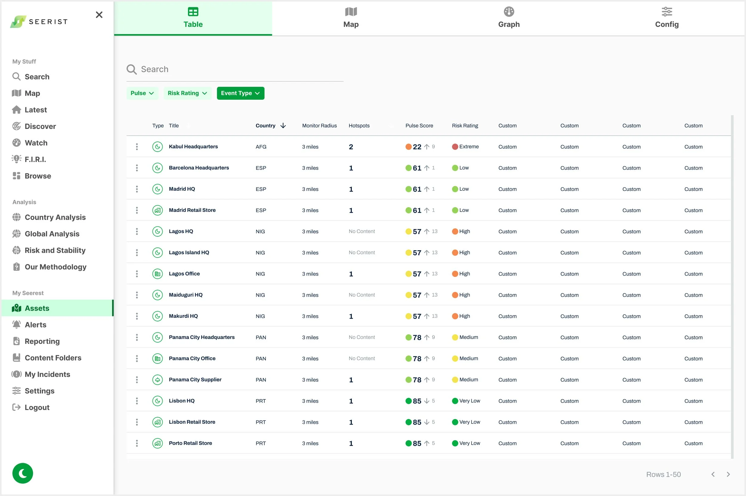
Table View
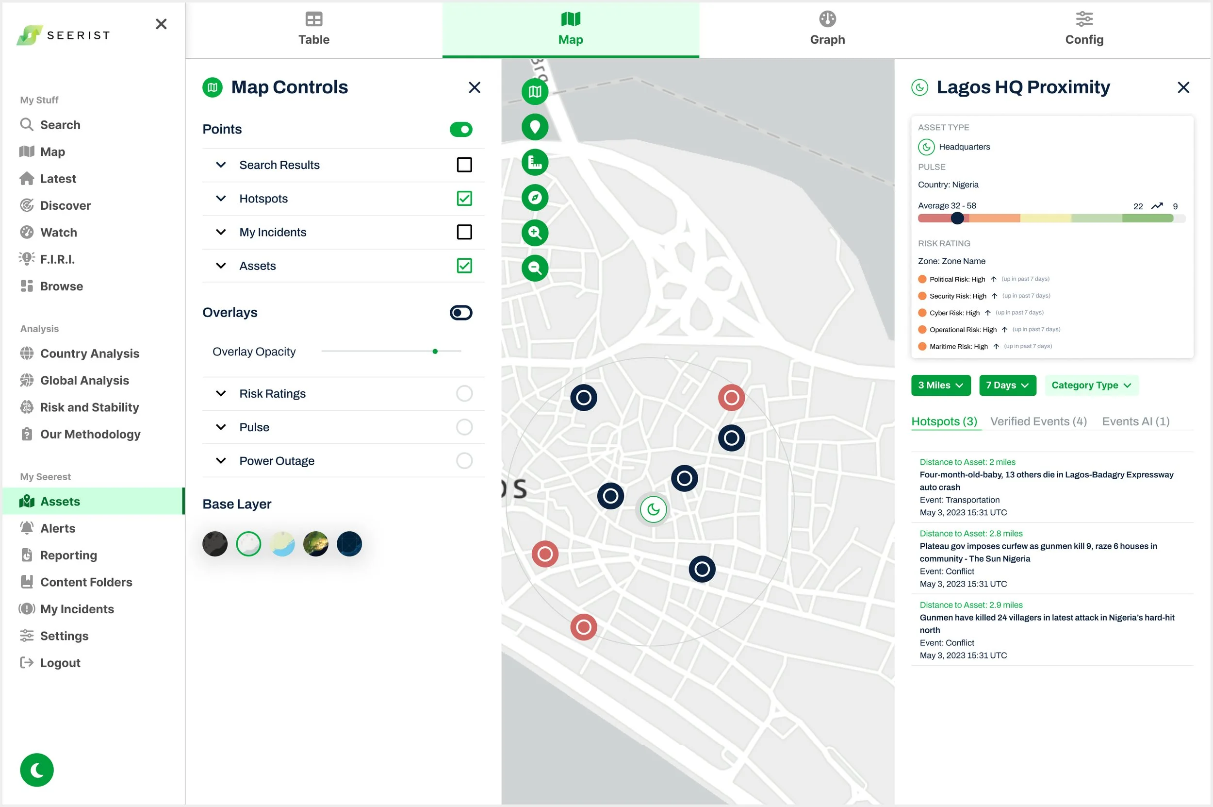
Map View
In alignment with the Product Manager’s directive, wireframes were created to demonstrate the integration of the Map Controls project across all ongoing conceptual efforts, for presentation to stakeholders.
To support a more intuitive way for users to explore data by Table or Map, I made several key interaction design decisions, demonstrated in this prototype
Table View
Enabled horizontal scrolling to support adding custom table fields, as requested by the Head of Product.
Map View
Hovering over an Asset brings its icon to the front and reveals its label.
Clicking an Asset zooms into it on the map.
Map Controls are now accessible directly from this view, in line with the Map Controls project.
Hovering over an Event reveals its type, and clicking takes the user to the corresponding article. This was a new feature requested by the Product Manager.
Selecting an Event icon now triggers feedback. Initial exploration included icon enlargement, with other options like color change to be considered later.
“This is brilliant. Cheyanne has done incredible work bringing our ideation to life and I am excited to move this to the next step.”
Feedback from Stakeholder Meeting
Due to the longer development time required to implement this top navigation bar and the risk of delaying the Asset Dashboard MVP, it was ultimately removed, as stakeholders prioritized a quicker solution to deliver value to users faster.
Final Iteration for MVP
Reduced user overwhelm and supported focused decision-making by applying progressive disclosure to surface primary asset threat intelligence workflow data while keeping secondary details accessible
To address user overwhelm while ensuring access to all necessary asset data, I applied the principle of progressive disclosure. Primary information is surfaced upfront, while secondary details (such as Pulse and Risk Rating data) are accessible through expandable sections within the Asset Dashboard. This helps users stay focused on key tasks without being overwhelmed.
Job to Be Done (Desktop):
As a security analyst, I want to identify which company asset has the highest number of conflict hotspots, visually review these threats on a map with detailed context, and download a comprehensive report so I can brief executive leadership with actionable intelligence.
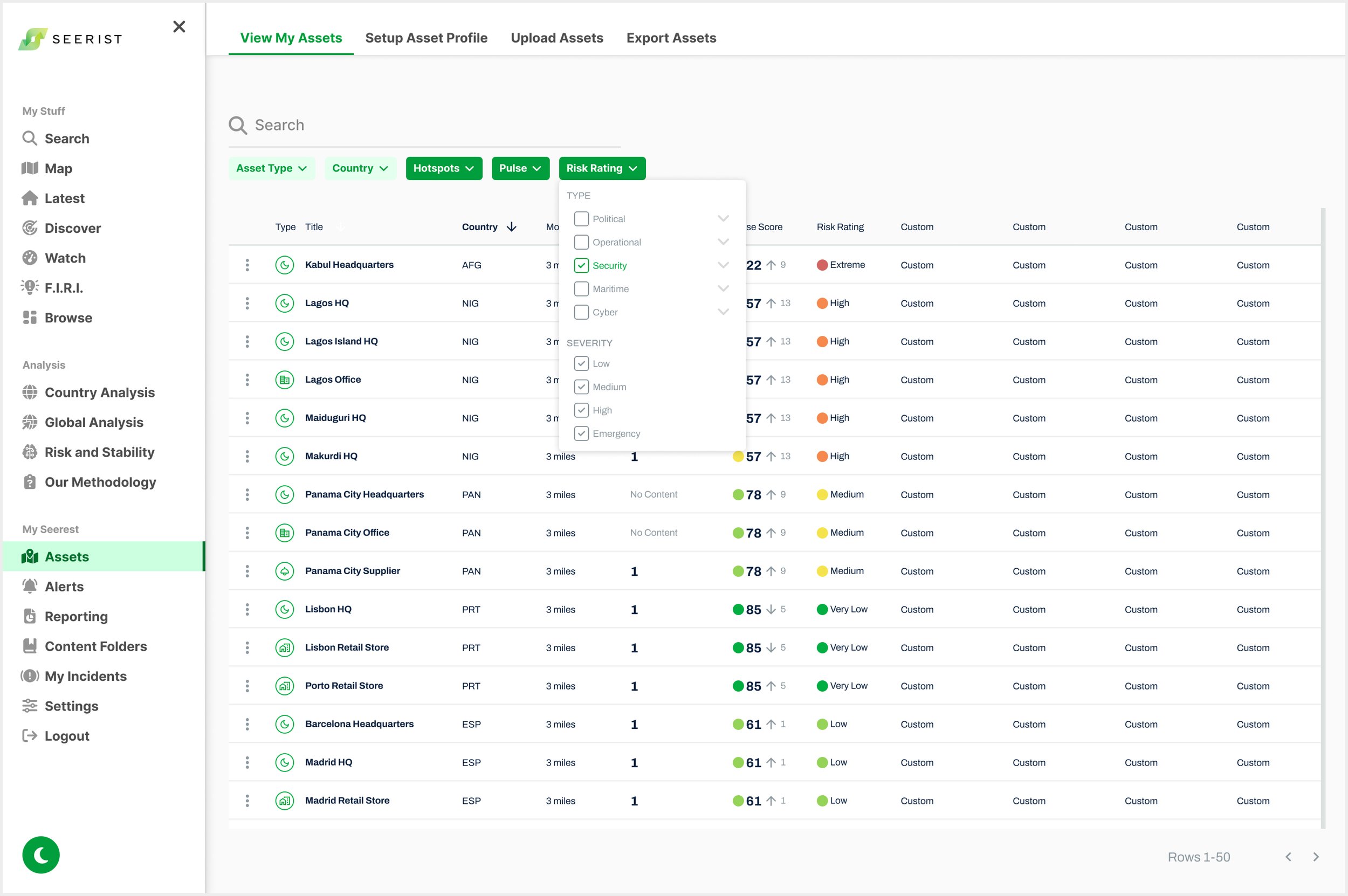
Asset Dashboard
A filter bar was created above the Asset table. Extensive design went into creating Filter Components that encapsulated all feedback from Stakeholders, Product and Development team.

Asset Action Menu

Pulse and Risk Rating Hover
A hover tooltip provides details on Pulse and Risk Rating data, including whether each is derived from the Country, City, or Zone level, along with the specific source name. It also serves as a color legend to clarify Pulse and Risk Rating visuals, since this feature was not available elsewhere on the platform.
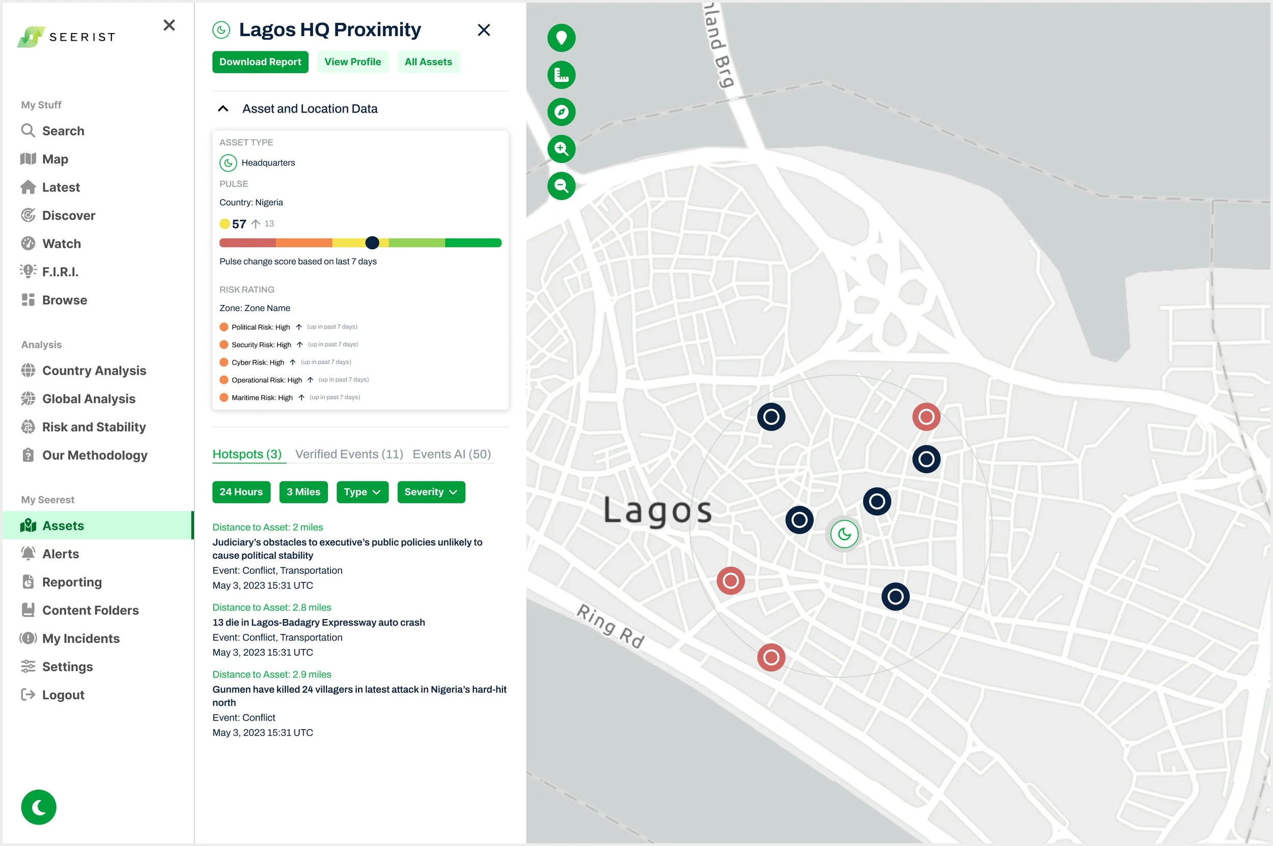
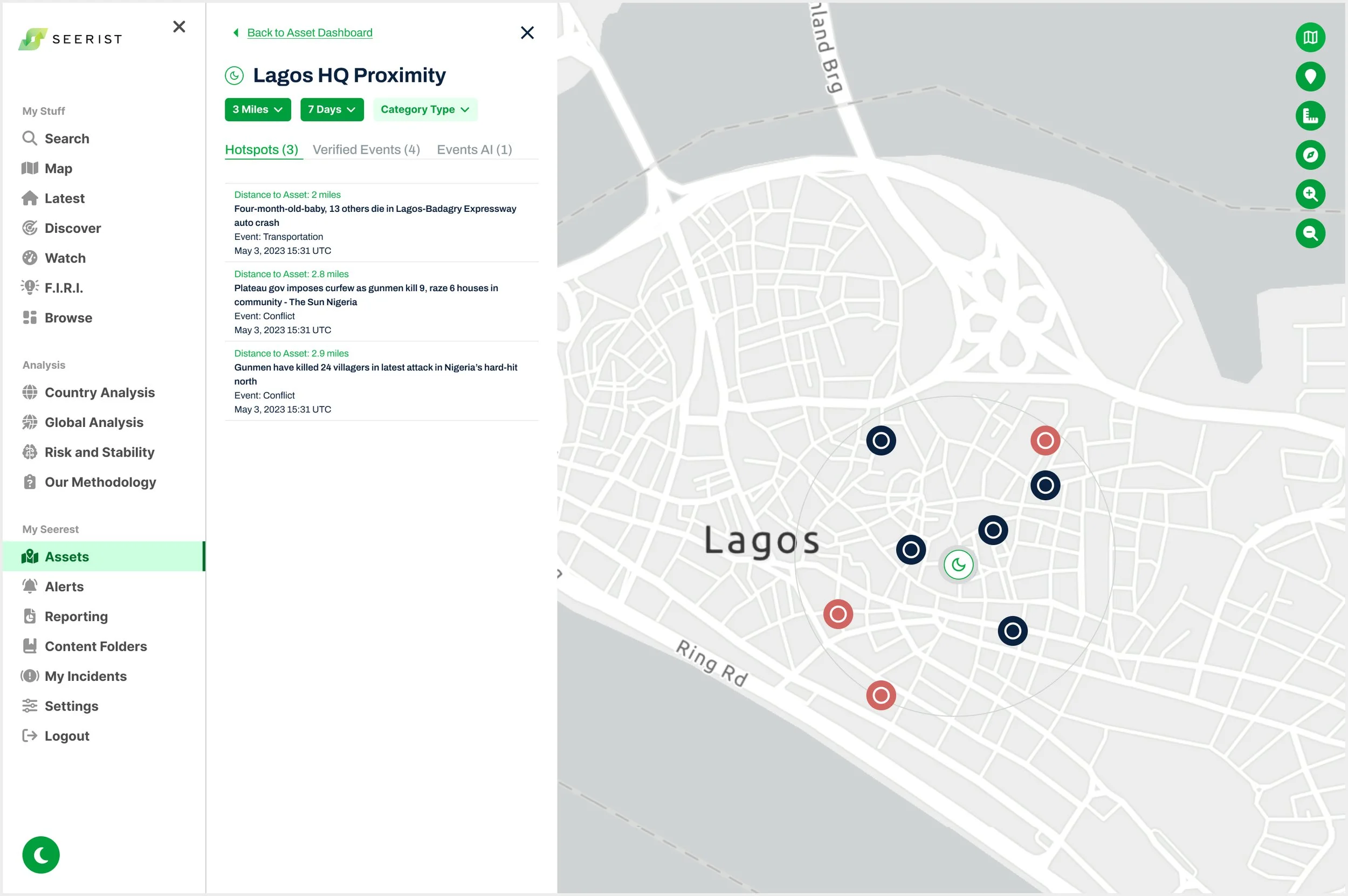
Asset Map View
A top navigation bar was added to the widget for quick access to key actions: Download Report, View Profile, and All Assets (to return to the Asset Dashboard). Asset and Location Data was moved into a collapsible dropdown, allowing users to hide it and focus on reading Event cards.
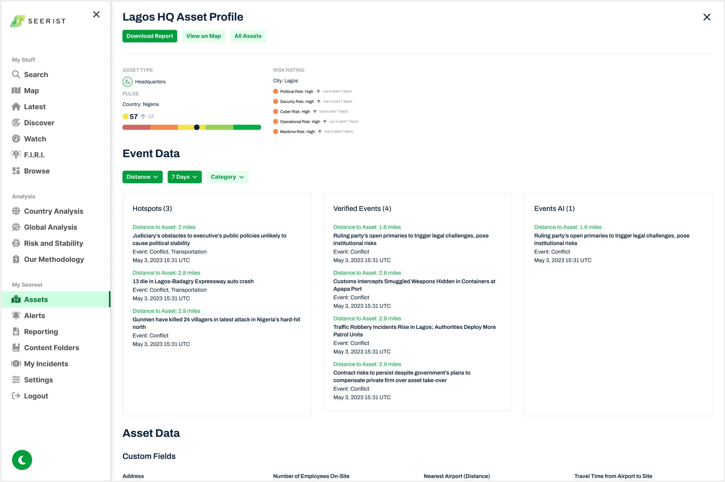
Asset Profile View
Users can access a detailed Asset Profile from both the Dashboard and Map views. The information shown on this page is what’s included when 'Download Report' is selected.
Native Mobile: iOS
Click Here for Figma High Fidelity Mobile Prototype
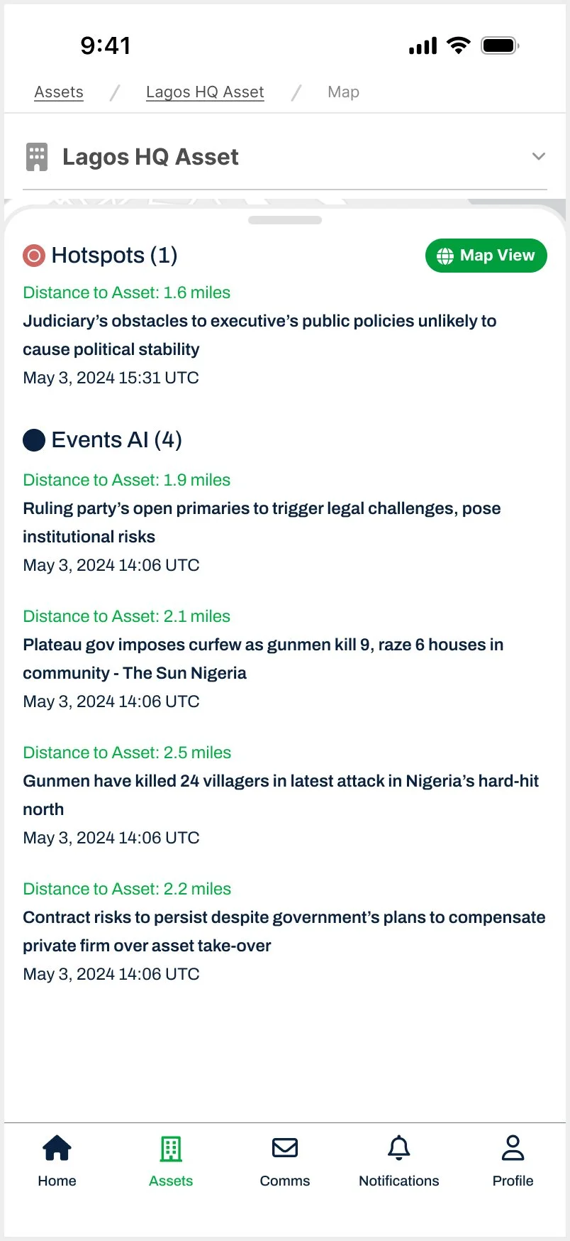
Enhanced user control and feedback by adding a breadcrumb bar, a clearly labeled back button, and an Asset selector dropdown
To improve navigation, I added an interactive breadcrumb bar that helps users track their location and return to any point in their workflow, especially within the Assets tab on mobile. I replaced modal close icons with a clear “Back to Event List” button in the top left to eliminate redundancy and reduce confusion, using descriptive text for added clarity. I also introduced an Asset selector dropdown, enabling users to switch between assets without leaving the current view.